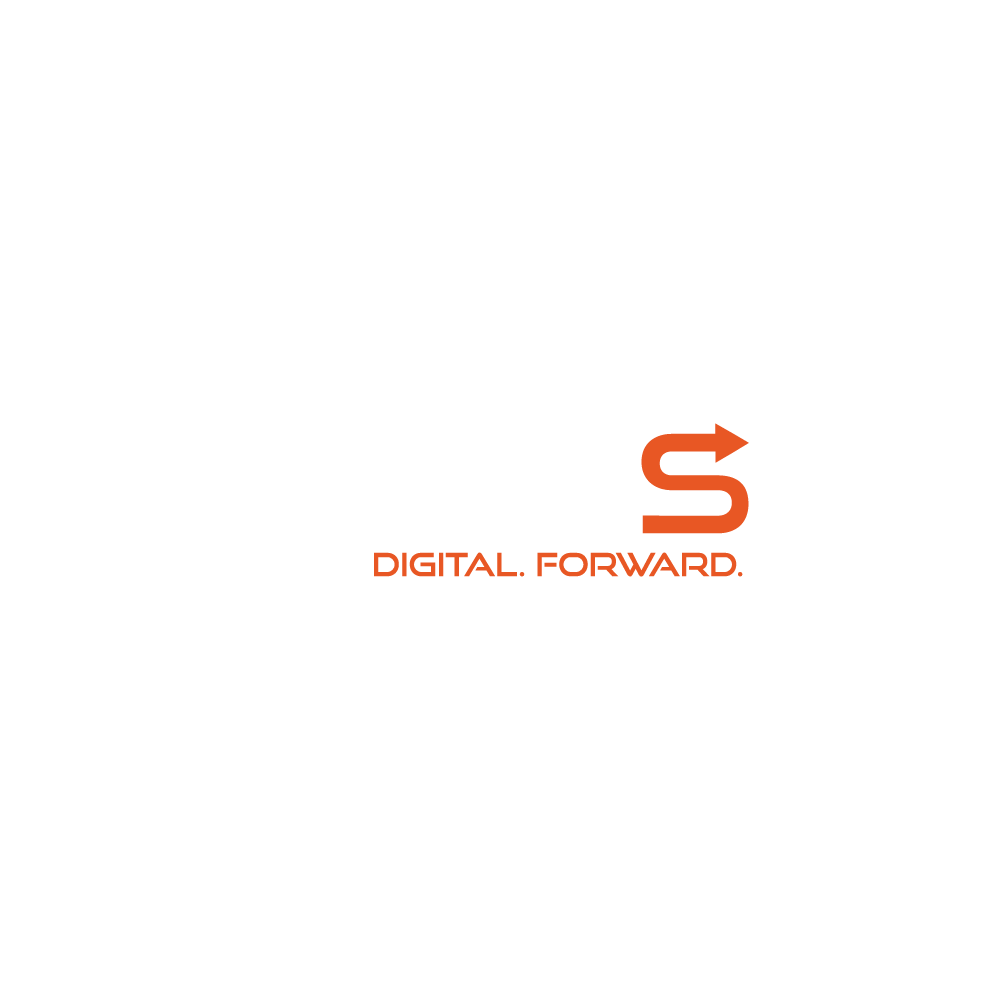
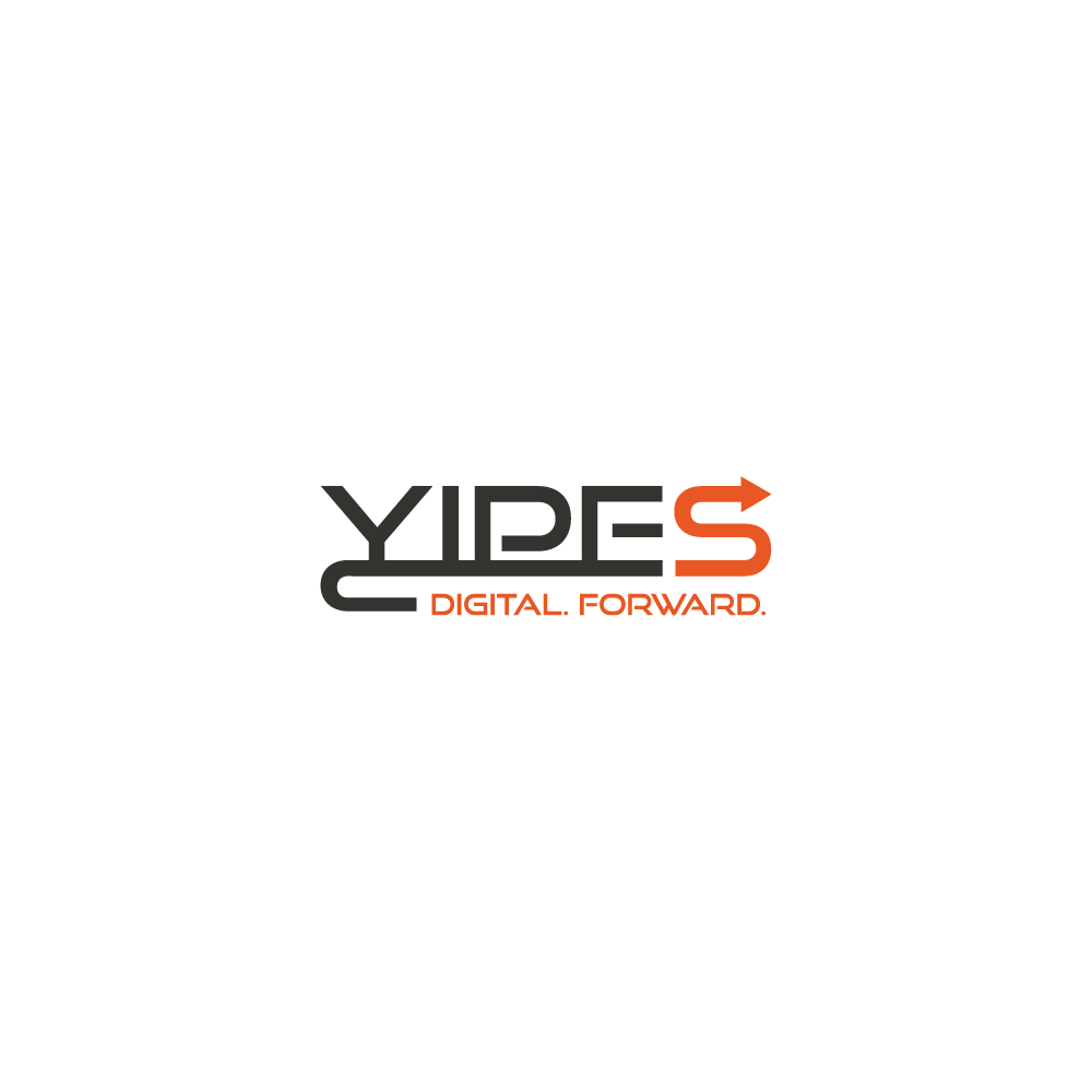
Yipes, a digital agency dedicated to assisting businesses in their initiation and expansion within digital markets. They wanted to approach their logo design with a focus on the agency name as a primary visual element. The objective was to convey a sense of forward momentum, aligning seamlessly with the tagline “Digital Forward.”
To encapsulate the brand’s attributes of trust, energy, and stability, a vibrant orange was selected as the primary color. This hue not only serves as a visual representation of the agency’s dynamic approach but also establishes a color palette that communicates reliability and enthusiasm, essential elements in the digital landscape.
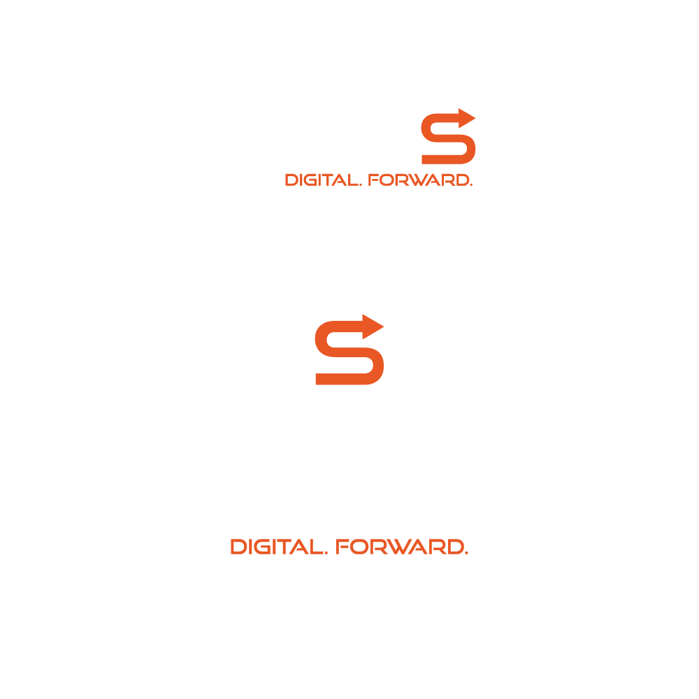
Scalability
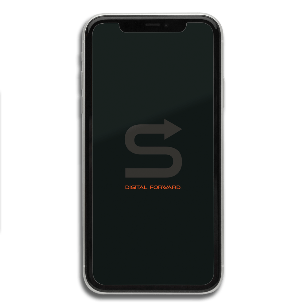
Given the nature of this wordmark logo, ensuring optimal scalability for diverse applications and dimensions was a major consideration.
The logo’s adaptability is illustrated through three distinct options for scalability:
Primary/Standard Logo
Logo Icon
Logo Tagline
Each option has been thoughtfully designed to maintain clarity and visual impact across a spectrum of applications and dimensions, ensuring a consistent and versatile representation of the brand.