To Do So is a digital marketing agency with expertise in SEO and social media marketing.
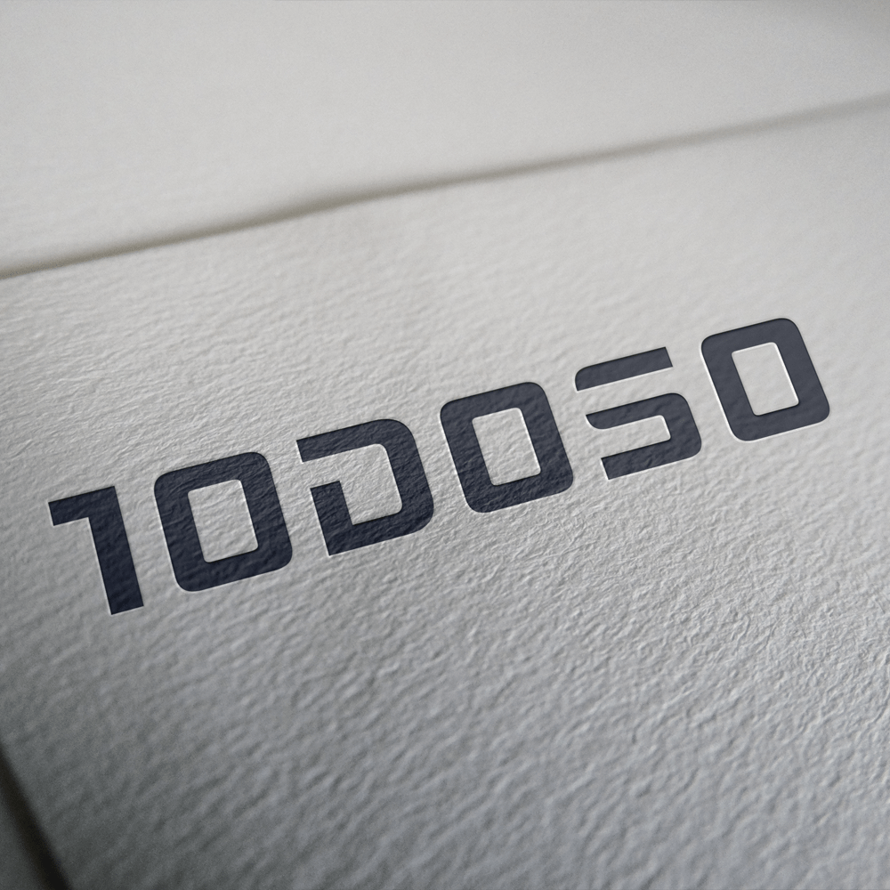
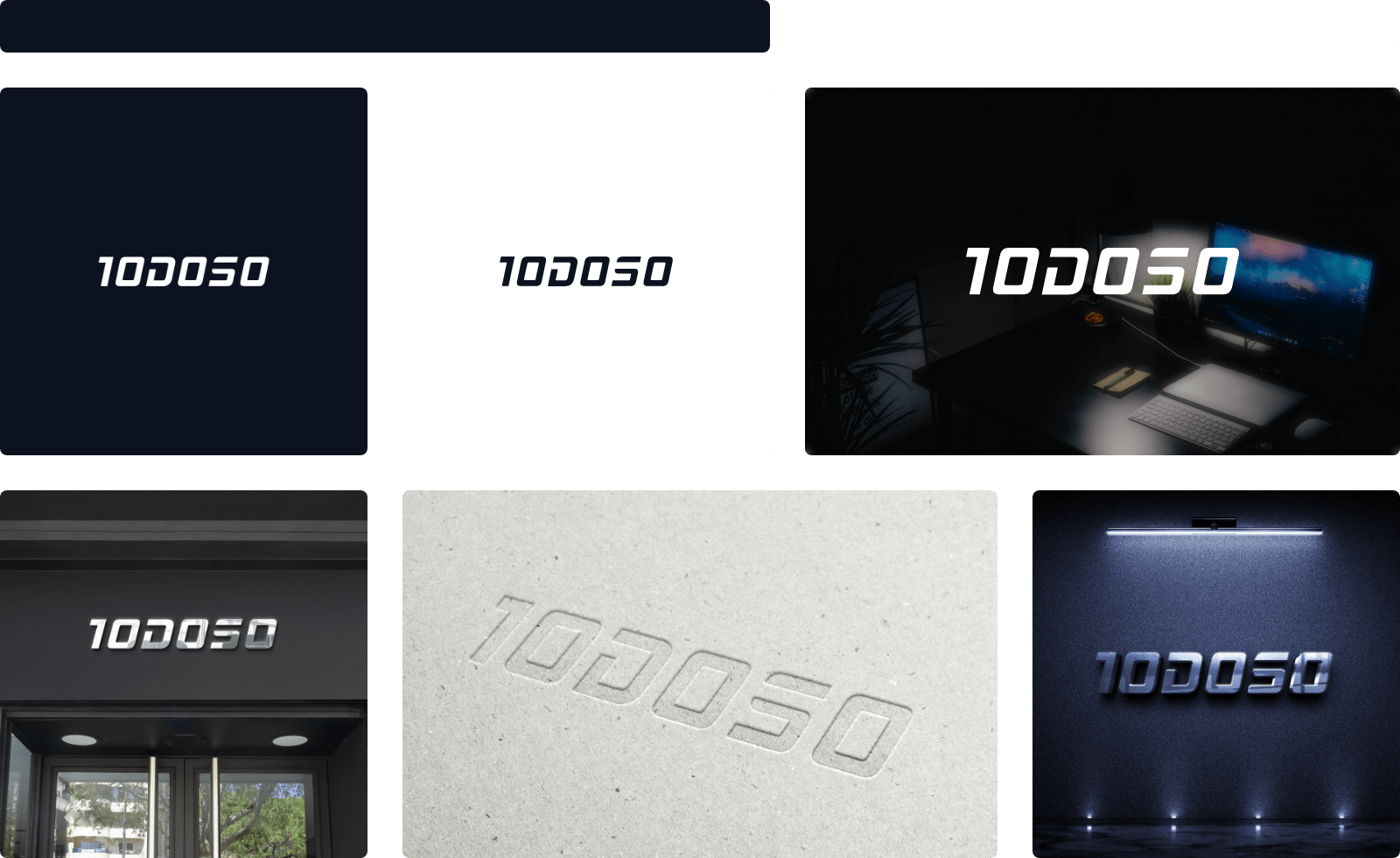
This project was a logo redesign, marking a 10-year-long business. The logo is thoughtfully crafted, featuring the surname initials of the three founders intricately arranged to form the company name “To Do So.”
Additionally, within the wordmark, the number 10 is seamlessly incorporated, symbolizing the impressive decade-long collaboration of the three founders. This nuanced design not only reflects the agency’s identity but also commemorates the significant milestone of a decade of collective expertise and collaboration within the digital marketing landscape.