Web platform
UI/UX Case study
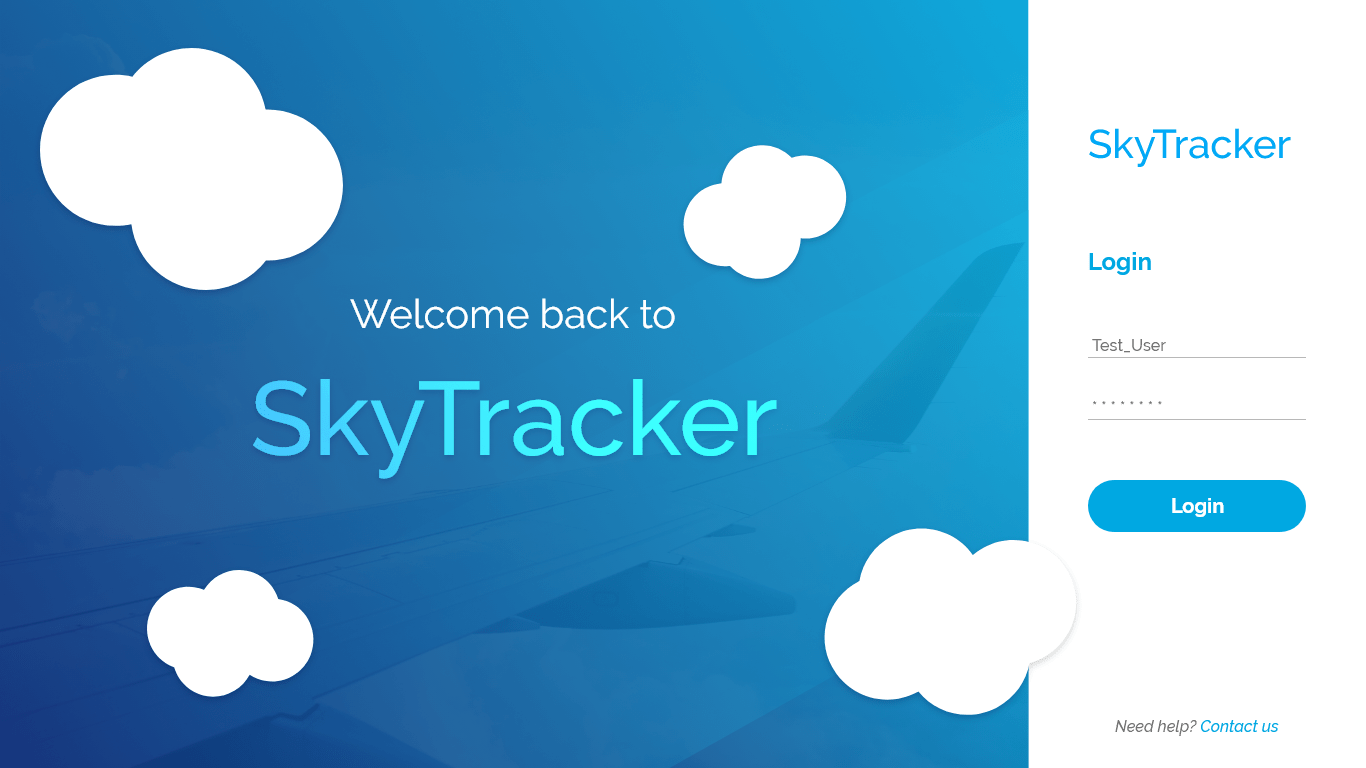
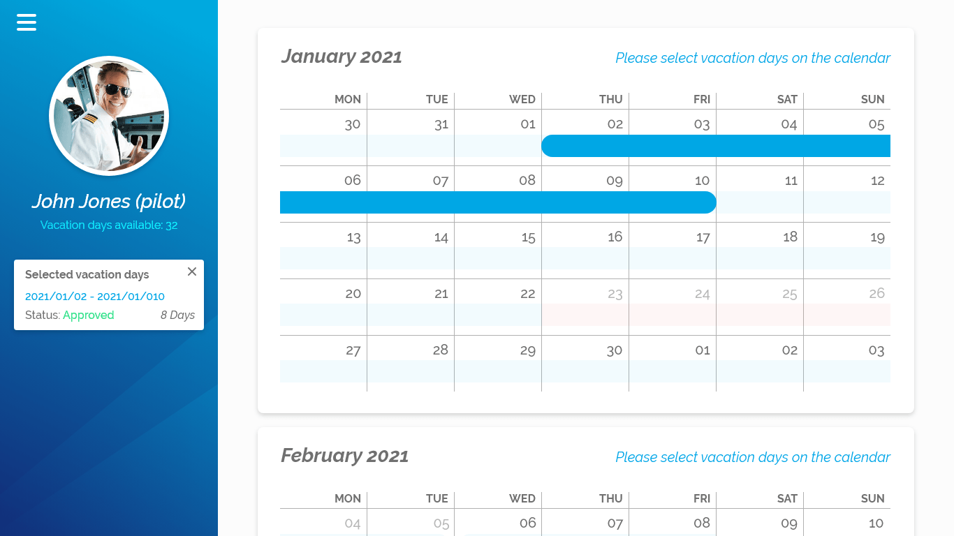
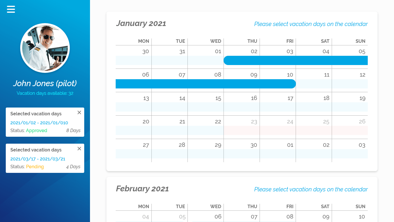
Sky Tracker
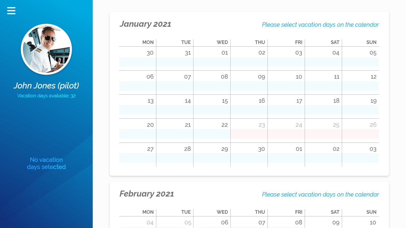
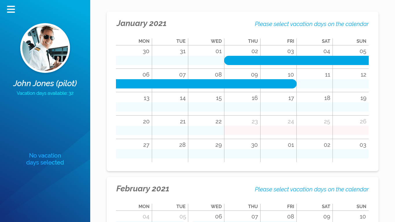
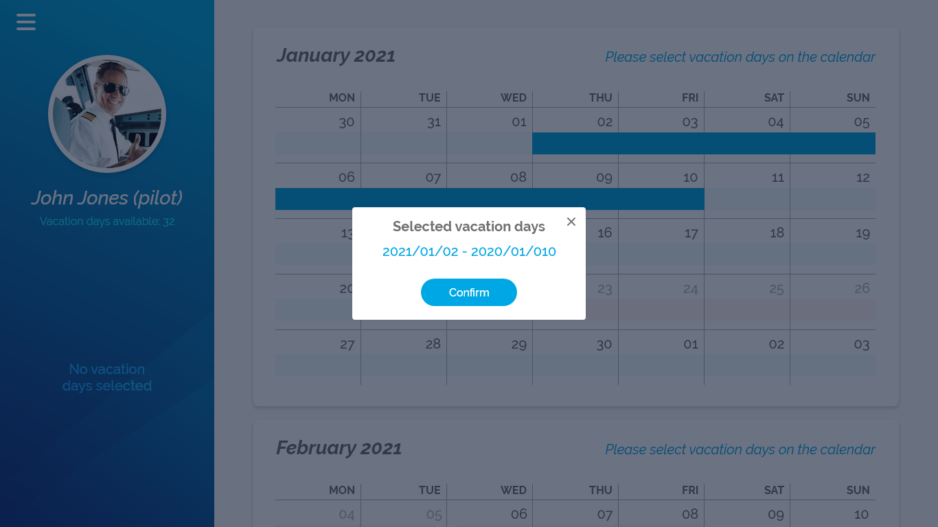
Sky Tracker is a web-based platform that uses an interactive calendar layout where pilots and other flight crew members
can schedule and reserve their vacation days.
Calendar layout gives users a simple and intuitive overview of vacation days for all crew members.
Sky Tracker is a great solution for scheduling and managing vacation and sick days. Bringing order in the chaotic and busy work schedules that flight crew members face on a daily basis.
Project overview
1. Build a calendar-based web app with a clear and simple UI layout while having interactive calendar features.
2. Create a user-centric product with new UI elements while respecting Sky Tracker brand colors and style.
Like with every other project, I started this one with a couple of rounds of research.
User research
User research was based on a two-dimension approach with questionnaires and user personas.
It is crucial to have insight into users and their context when designing products like this.
Questionnaire
A questionnaire was composed of two parts. The first part was a set of questions dedicated to describing the user. In this part of the research we have three types of questions:
1. Personal
2. Professional
3. Technical
Later on, I would use this information to create user personas. The second part of the questions was centred around the purpose of this product. From these questions, I got important information on how to structure the platform and create basic wireframing.
Age, gender, professional background?
Tell me about your current system for scheduling vacation days.
Tell me about your past and current work experience.
How often do you change your monthly shift schedule?
User personas
The purpose of personas is to create reliable and realistic representations of key audience segments for reference.
These representations are based on previous user research and web analytics.
User persona type 1
Gender: Male
Education: Aviation Academy
Position: Pilot
Softer knowledge: High
Responsibilities: High
User persona type 2
Gender: Male
Education: FA school
Position: Flight attendant Softer knowledge: Medium Responsibilities: High
Product research
This research was established by gathering as much as possible information about similar platforms and calendar-based apps.
Searching for similar products, successful and unsuccessful projects, potential problems, interesting features,
navigation flows, etc…
Learning about different layouts and possibilities was crucial
in developing a solid wireframe and basic user journey.
Brand research
This was basic research regarding Sky Tracker brand, visual feel and style. Typography and color information were enough to convey their brand style into this platform.
Based on this research I created UI components like buttons, scrollbars, properties panel and others…
With simple components and an interactive calendar, the design layout was created with the main focus on the
important segments.
Low fidelity wireframes
Basic sketches of UI layout with some user flow explanations. Positioning calendar and other UI elements according to previous research and user requirements.
The purpose of creating this wireframe was to locate possible confusion and usability problems.
This wireframe was presented to the real users (pilots and flight crewmembers) to get their opinions on basic structure and navigation.
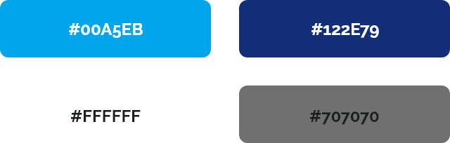
Colors
Sky blue
The primary brand color.
Navy blue
This shade of blue works nicely as a complementary color to the primary one. Not the brand.
White
Used for general text purposes and as a background color.
Dark grey
Used for label text purposes and general text purposes on light backgrounds.
Colors
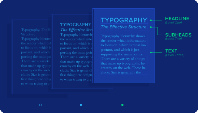
Typography
Typeface used:
Railway
Font weight used:
Regular, Medium and Bold
Font sizes used:
14 – 28px
Line spacing:
24 – 56px
Colors
User testing
I created a prototype using Adobe XD for testing purposes. Standard user testing was conducted to find possible usability problems.
All testing participants were people who participated in the questionnaires and people from the airline industry.
Survey
At the end of the user testing, a survey is provided with specific questions about the user journey, usability and possible enhancements.
Some of the survey questions:
1. How easy/hard was it to use/find (specific) features?
2. Did you have problems navigating through the platform?
3. Describe how you used the interactive calendar.
4. Is there any other features you would like to have and why?
Work overview
1. User research (questionnaires and user personas)
2. Product research
3. Brand research
4. Creating low-fidelity wireframes
5. Creating UI layout, components and libraries
6. User testing
7. Surveys
8. Adjustments
Other web projects

Quantom
Ui/Ux Case Study
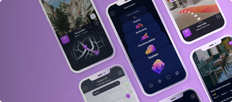
Saraja
Modern mobile app with augmented reality, navigation, new forms of information usage and advertisement.
Ui/Ux Case Study

Hotspoter
Location Intelligence platform that provides the spots with the highest visitation impact in any place of interest.