Location intelligence platform
UI/UX Case study
Hotspoter
Hotspoter is a location intelligence platform that provides the spots with the highest visitation impact (aka hotspots) in any place of interest. This platform can distinguish what are the most frequently visited places and which ones are responding to any business needs.
Being a modular platform, Hotspoter has different modules for the Financial sector, Marketing, Retail and one general module.
This modular approach enables the best possible results for every business sector as it takes into consideration only
domain-specific data and combines it with related data from public and social networks.
Project overview
1. Create a location or map-based platform with UI elements for optimizing analysis criteria.
2. Optimization options have to differ regarding different types of users for different industries (Financial, Marketing and Retail).
3. Every “hotspot” has to contain 3 – 8 different types of information based on the location, analysis results and
industry type.
4. Create data import options from which users could generate an analysis for existing stores, ATMs, billboards…
For the length purposes of this portfolio, I’m going to use only the financial sector as an example.
Research
This project started with three rounds of research regarding three different industry branches (Financial, Marketing and Retail).
Among other useful insights, this type of research was conducted to create surveys with the right set of questions for each industry branch.
Also, standard research about similar platforms, competition and map-based projects was conducted.
Brand style, UI components and elements, typography and colour theory were also a part of this research.
Questionnaire
A questionnaire with 20 basic questions was created and distributed to people who work in banks and financial sectors.
Managers, team and sector leads had the most impact since they were going to use this platform the most.
The first set of questions (10) were more general questions about their work, preferences and technical ability. From this set, I gathered enough information to create user personas.
The second set of questions (10) were more direct questions about the way this platform is going to be used. This set of questions provided knowledge about needed options and architecture while distinguishing more and less important features.
What is your position in this company?
Can you tell us more about your work and educational background?
Can you tell us about your technical abilities and software knowledge?
Important features and options you would like to have on this platform?
User personas
From the first set of questions, I created a few different user personas, mostly depending on the position at the company.
All personas shared a couple of common qualities such as high and faculty education and good standard software knowledge (Microsoft Office software and internal financial platforms).
User persona type 1
Education: High or faculty
Position: Team lead
Software knowledge: High
Responsibilities: Medium to high priority
User persona type 2
Education: High or faculty
Position: CEO, manager
Software knowledge: Medium
Responsibilities: High priority
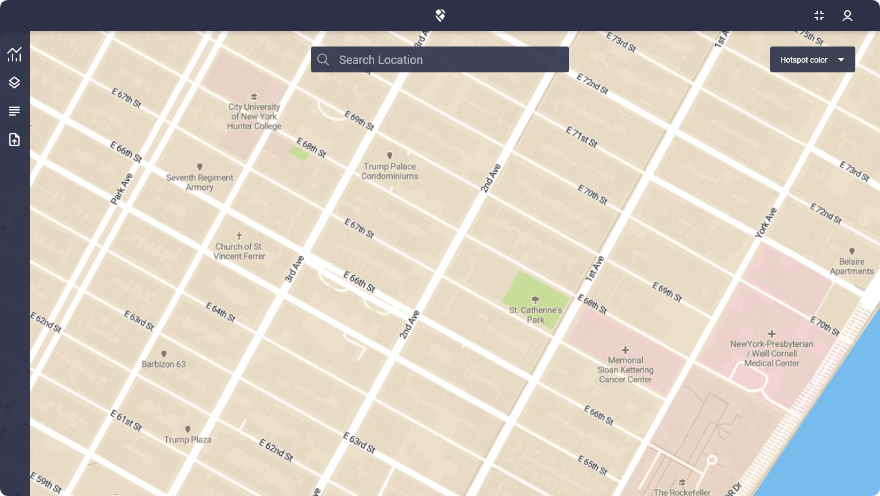
Low fidelity wireframes
A couple of different low-fidelity sketches were created to determine the platform’s architecture and basic layout.
Since this is a map-based platform and the map is the most important element, components had to be distributed and designed in a way to prevent UI cluttering which will compromise the view of the map.
Two main wireframes were suggested:
1. Widgets
2. Side menu (drawer)
Low fidelity wireframes
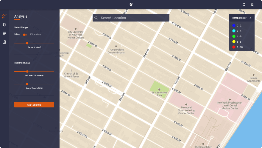
After two rounds of brainstorming the decision has been made to use a mix of widgets for information purposes and a side drawer for general options.
Side drawer options:
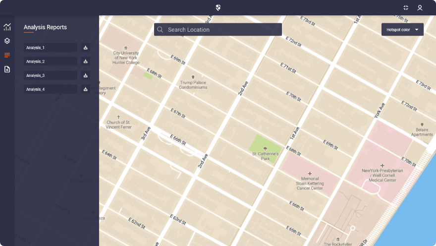
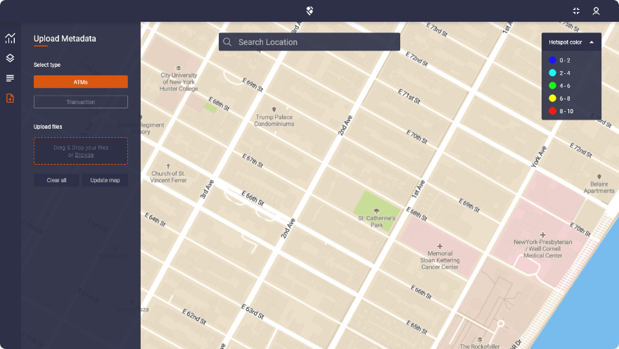
1. Analysis
2. Layer options
3. Reports
4. Metadata upload
Colors
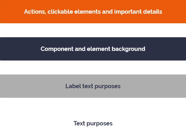
Orange – primary color
The primary color is the brand color itself. Mostly used for clickable elements, different actions and important details.
Neutral blue – secondary color
This secondary color gives a nice contrast between all colors in this project (orange, white and light grey). Mostly used for element, section and component backgrounds.
Light grey – tertiary color
Used for label text purposes, a subtle but noticeable difference from plain white color.
White – tertiary color
Used for general text purposes and icons. Good contrast on the neutral blue background makes the text easily readable.
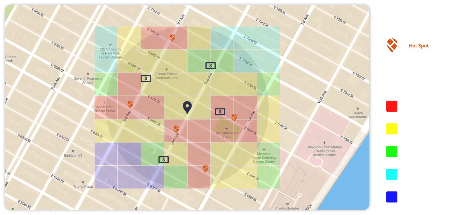
Low fidelity wireframes
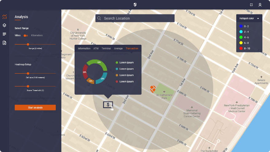
Map legend
User testing
Before the launch of the first version of the platform, I created a prototype for testing purposes. Testing was conducted on subjects who filled out the questionnaire at the beginning of the project.
User testing was mandatory to make sure that the platform was easy to use. The platform should provide a satisfactory experience to the users.
The main goal was to reveal areas of confusion and uncover opportunities to improve the overall user experience.
Survey
At the end of the user testing, a survey is provided with specific questions about the user journey, usability and possible enhancements.
Some of the survey questions:
1. How easy/hard was it to use this platform?
2. Did you have problems navigating through the platform?
3. Did you find important features easily?
4. Questions about specific features?
5. Is there something you wish to change or adjust and why?
Adjustments
From surveys, I gathered a lot of useful information, more in the form of enhancements and adjustments than a redesign or other big changes.
Some of the adjustments:
1. More options (show/hide) added in the layer section
2. Micro animations added (analyzing, uploading, generating)
3. Edit option in the report section
4. Full-screen possibility
Conclusion
Detailed research about different industries and possible users was the key to the success of this project.
Conducting testing and surveys was a good path to create the good first version of the platform, a solid base for
future requirements.
Easy navigation with familiar components and information widgets were the main properties of this platform that got the highest score on user testing.
Work overview
1. Research (company, industries, competition, design style…)
2. Questionnaire
3. Creating user personas
4. Creating low-fidelity wireframes
5. User interface design (components, elements, colors, typography, etc…)
6. User testing
7. Surveys
8. Adjustments
Other web projects

Ava
A web platform with a goal to enable individuals, and organizations to make the best safety-related decisions.
Ui/Ux Designer (employment)
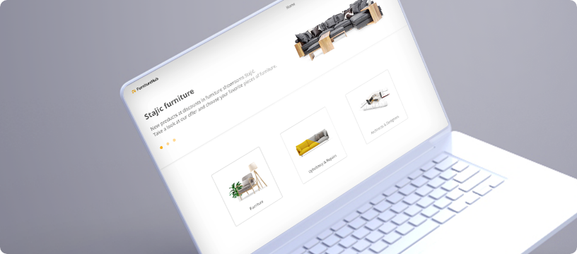
FurnitureHub
FurnitureHub is a digital association platform suited for companies and individuals in the furniture industry.
Ui/Ux Case Study
Sky Tracker
A web platform with an interactive calendar layout where flight crew members can schedule vacation days.