Online furniture platform
UI/UX Case study
FurnitureHub
FurnitureHub is a digital association platform suited for companies and individuals in the furniture industry, providing everything you would expect from a real international fair and even more.
FurnitureHub offers an authentic international fair experience from the comfort of your own home or office.
Suppliers are presented with a unique place to exhibit their services and products to potential buyers, and on the other hand, buyers are provided with an abundance of products and services within a wide range of categories to choose from.
Project overview
Since FurnitureHub is not a standard e-commerce platform the key to a good UX was detailed research with interviews
and surveys.
On one hand, understanding key problems and challenges that suppliers face in their industry, and on the other hand, understanding the difficulties and needs that buyers usually have.
This platform is built in two parts:
1. Front view – View that all buyers see
2. Dashboard – View for suppliers (uploading products and company information)
Interviews
Participants who were interviewed can be divided into two groups:
1. Customers – people who use e-commerce platforms for shopping and browsing.
2. Manufacturers and salons – business owners, managers and workers.
Both groups provided necessary information about the advantages and disadvantages of the industry, the problems and challenges they face every day. Based on this information further research is conducted and user personas are created.
User Interface


User personas
Based on conducted interviews a few types of user personas are created to better understand the people who are going to use this platform.
1. Suppliers – companies and individuals that might use our platform to present their products and services.
The background of these potential users can be from small business owners and managers to the common worker and even a marketing team. For each of these subgroups, three different user personas are created.
2. Customers – individuals and businesses looking to buy products and/or looking to use furniture-related services such as upholstery, restorations and repairs.
After the personas were created research was conducted to narrow down the selection of a common user type for
each group.
This way it is easier to understand real problems users are facing and potential solutions to these problems. Understanding real problems is the first step in building an intuitive and easy-to-use platform for both groups.
Problems
Suppliers
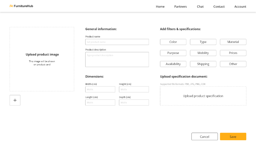
1. Complicated uploading process
2. Not enough exposure (small businesses)
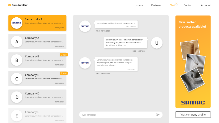
3. Difficult communication with customers
4. Intuitive product catalogue
5. Sales and overall analytics
Customers
1. Have to visit too many different shops (websites)
2. Trust – reliable companies
3. Product comparison
4. Not enough information about the product or the company
5. Difficult navigation (user journey)
Solutions
Suppliers
1. Intuitive uploading process with modal dialogues
2. Exposure on the platform in the form of ads, banners and pages
3. Easy-to-use chat service integrated into the platform
4. Free to use digital catalogue from uploaded products
5. Weekly and monthly analytics based on customer behaviour
Customers
1. Furniture products and services all on one platform
2. Allowing customers to leave reviews for the specific company
3. Easy product and price comparison
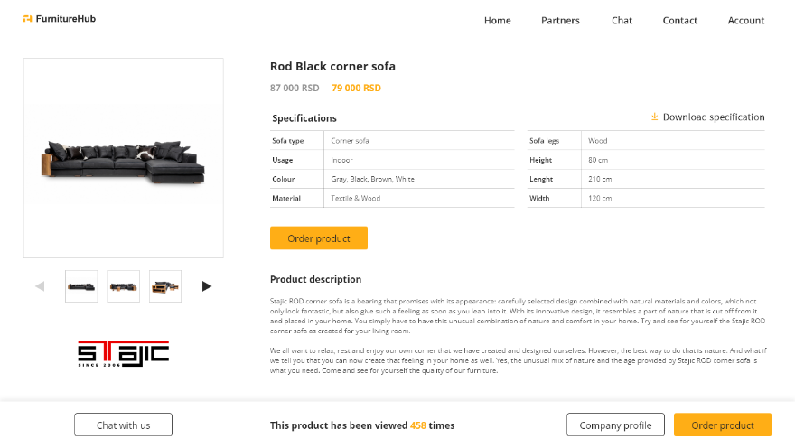
4. Product detail page + company profile page
5. Intuitive navigation based on categories and product list system
Low fidelity wireframes
I usually start the design process with low-fidelity wireframes. This is the way I iterate through many design options quickly. Simple and fast sketches of main screens for both use cases.
The main purpose of these sketches was to present my solution and to test and brainstorm ideas with FurnitureHub team.
I created two versions for each user flow, explaining the layout and arrangement of the elements.
In this case, low-fidelity wireframes helped to create a basic layout and navigation based on business requirements and goals.
Card sorting
Based on low fidelity wireframing the biggest discussions were about navigation or user flows. I decided to go with card sorting sessions for the main categories and navigation in general.
This method helped us to understand the easiest and most intuitive ways of navigation for both customers and suppliers.
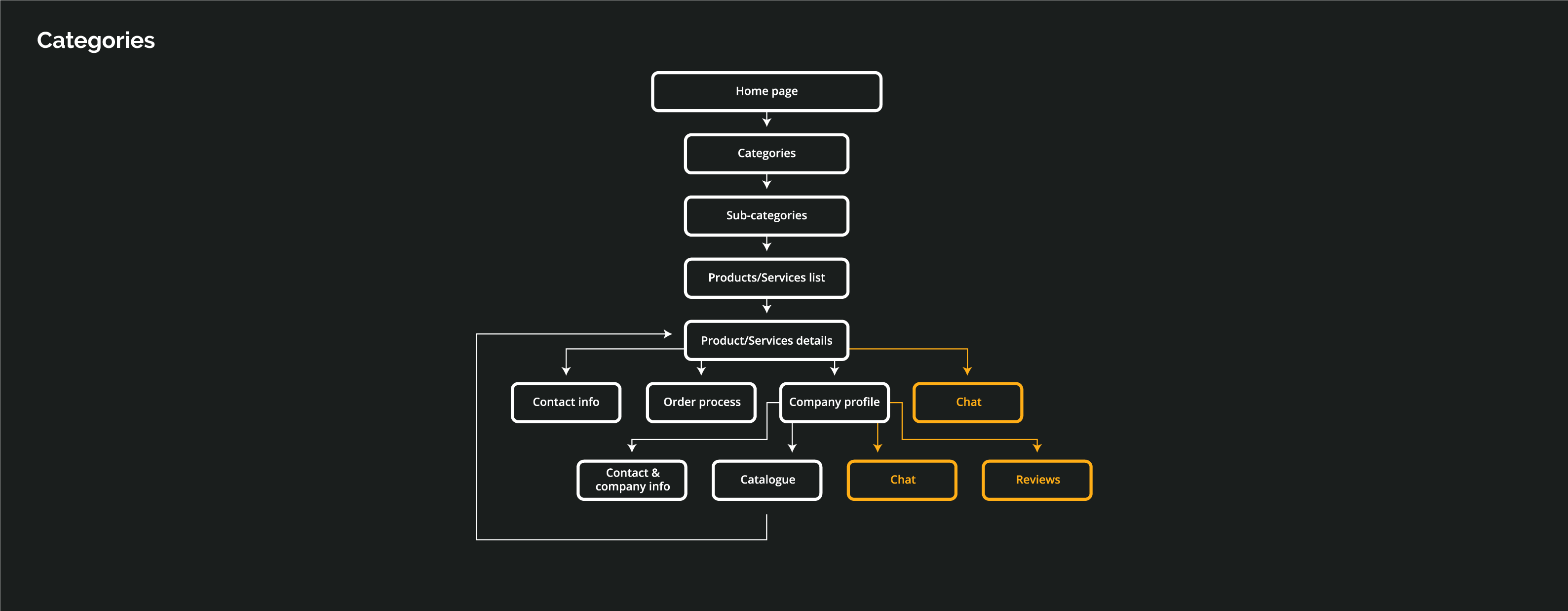
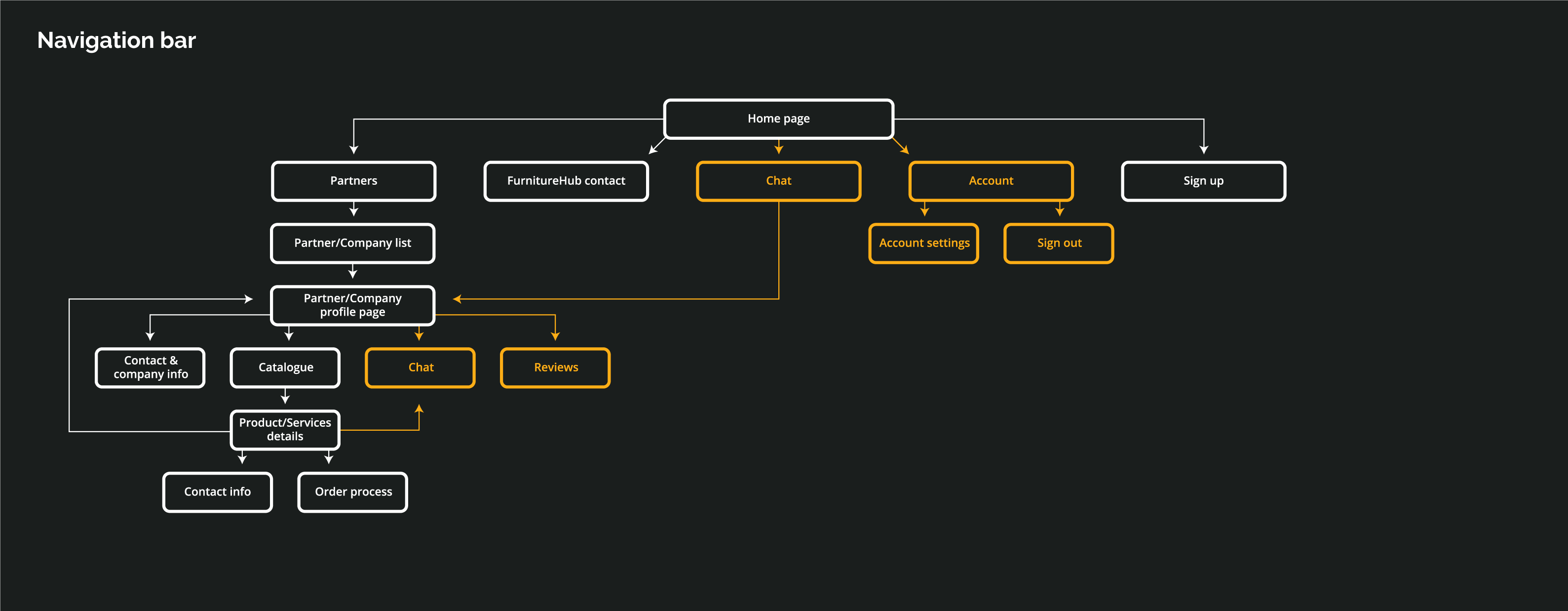
The new navigation structure suggested two navigation routes:
1. Categories – all screens related to products or services
2. Navigation bar – home and other pages such as chat service, company pages, account details, etc.
Customer journey
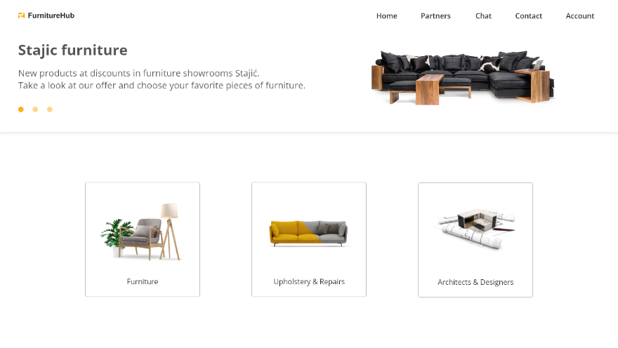
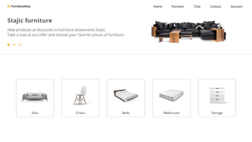
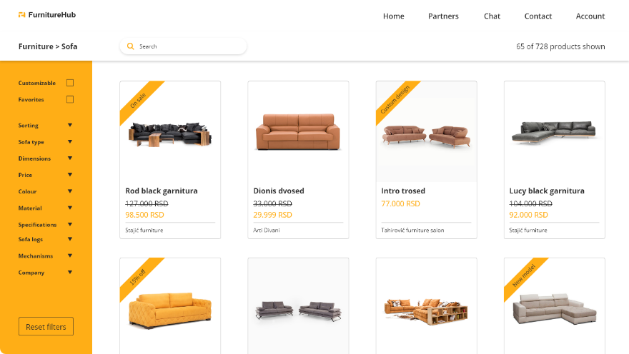
The customer journey starts on the home page with a simple and intuitive layout.
1. Navigation bar
2. Banner (for marketing purposes)
3. Categories (Product & Services)
We have two main user flows shown in the images below:
1. Navigation bar
2. Categories
Card sorting
There are a couple of differences between customers that have accounts and customers that don’t have one,
so their journeys differ.
Benefits of users with accounts:
1. Chat services
2. Leaving and viewing company reviews
3. Favorite products (save product)
4. Mailing list (discounts, special offers)
Users that have accounts are marked with yellow color on the images below.
User Interface
The user interface is based on simplicity and a modern minimalist look, using familiar components such as product cards, modal dialogues and others. Designed in that way so every user can easily navigate and use the platform without too much effort.
A simple yet intuitive layout offers customers (and suppliers) a pleasant experience and a faster way of getting the right and clear information.
The main colors used are brand colors. In that way, we get a connection between the brand and the digital product.
User Interface

Ui components
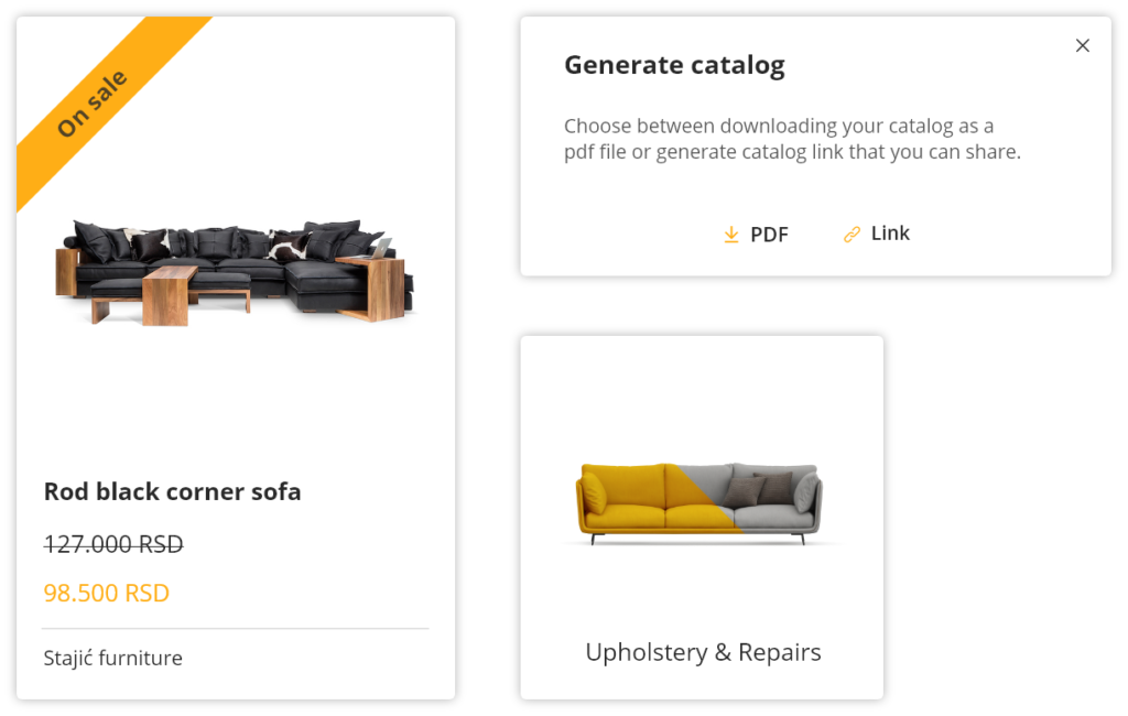
Product cards
Standard UI card design with the summary of the product’s most important information and details.
Modal dialogs
Modal dialogues make navigation easier and more intuitive, eliminating the need to leave the current page to perform some actions. Especially helpful for suppliers.
Category cards
Main product navigation uses category and subcategory cards
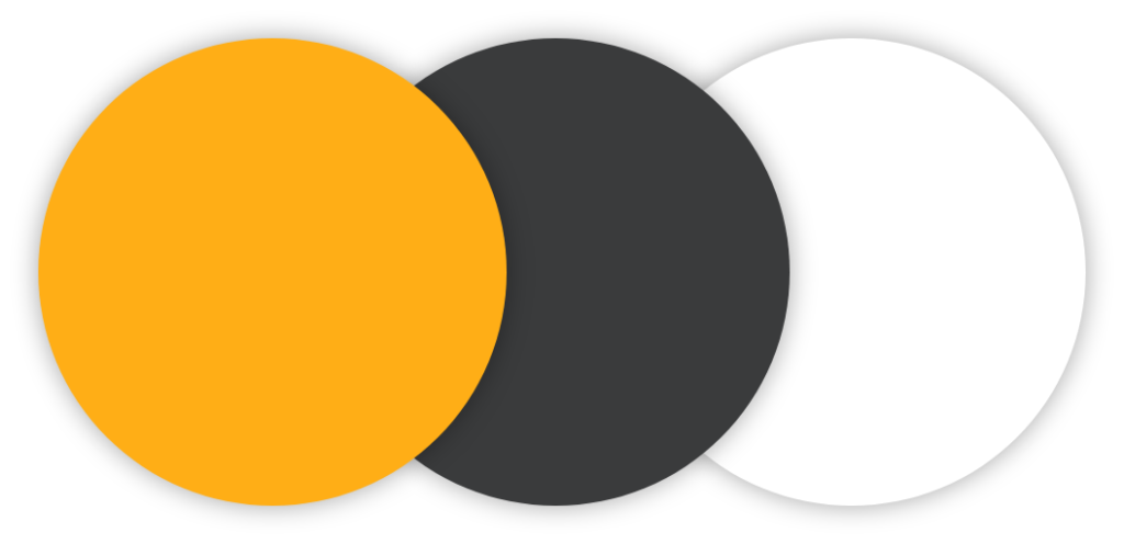
Colors
Orange – is considered an energetic color
Orange calls to mind feelings of excitement, enthusiasm, and warmth. Orange is often used to draw attention and it is very suitable for advertisement.
Dark grey – neutrality and balance
Sophisticated color that lacks the negativity of the color black. Here, this color is mainly used for text and descriptions.
White – represents purity and simplicity
The color white often seems like a blank slate, symbolizing a new beginning or a fresh start.
Low fidelity wireframes
User testing
Before launching the product, I conducted testing rounds to reveal possible usability problems.
1st round – testing within a group of people that often use similar platforms.
2nd round – testing within a group of people who don’t use similar platforms often.
It was important to have these two groups since a lot of different people will use this platform and we needed different opinions.
Survey
Some of the insights I gathered impacted the release version of the product, to name some:
1. Company page – layout reorder (Supplier)
2. Digital catalogue – fewer steps to reach (Supplier)
3. Image upload – image crop option (Supplier)
4. Product cards – add discount price (Supplier)
5. Product detail page – chat button visibility (Customer)
6. Product list page – changed sorting options (Customer)
7. All screens – increased line spacing on the description text
Business in design
One of the key goals of this project is to keep suppliers on the platform and we did that by offering them different features and options that other similar platforms don’t have, such as:
1. Digital catalogue (easy to create and share in the form of a link)
2. Easy uploading process
3. Cloud storage space for images and files
4. Chat service
5. Place for advertisement (banners and ads on the platform)
6. Product analytics and more …
Conclusion
The business model is a standard monthly subscription with different packages and prices. Depending on the package you will have different features and advertisement options.
This way a scalable platform is created with a great structure that is always able to add more features and options to new or existing packages, keeping the product alive and interesting while helping suppliers run their business more easily and sufficiently.
Work overview
1. Research (company, industry, competition, design style…)
2. Conducting interviews
3. Creating user personas
4. Listing problems and possible solutions
5. Creating low-fidelity wireframes
6. Using card sorting technique for user flows
7. Mapping user flows (customer journey)
8. User interface design (components, elements, colors, typography, etc…)
9. User testing
10. Adjustments based on user testing
Other web projects

Quantom
Ui/Ux Case Study
Saraja
Modern mobile app with augmented reality, navigation, new forms of information usage and advertisement.
Ui/Ux Case Study

Hotspoter
Location Intelligence platform that provides the spots with the highest visitation impact in any place of interest.