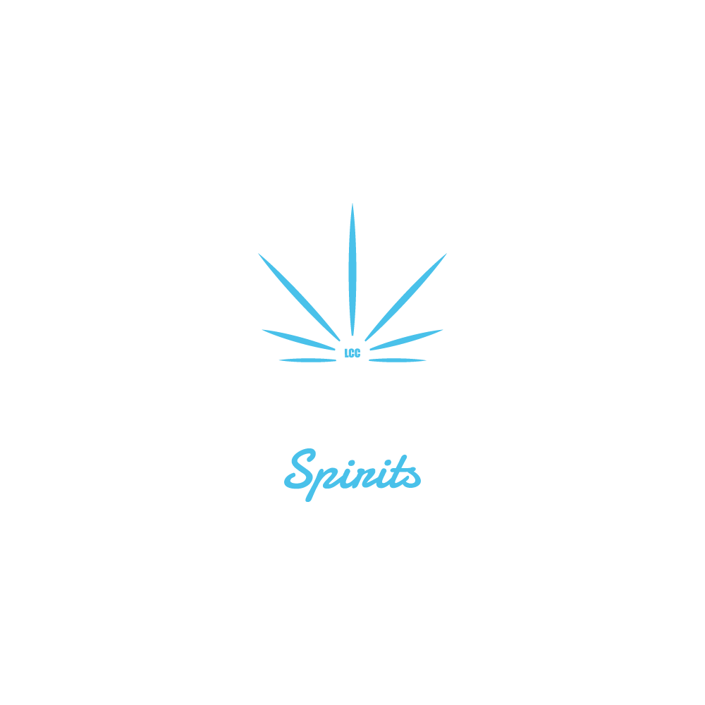
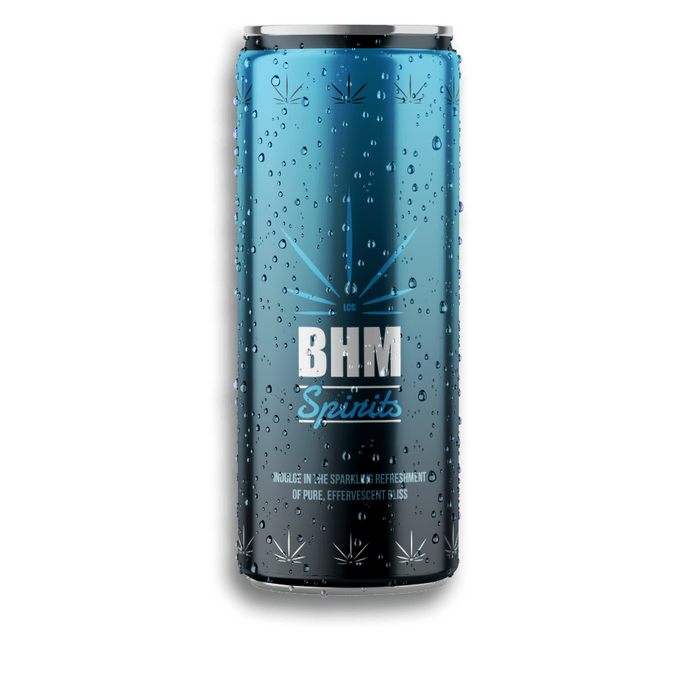
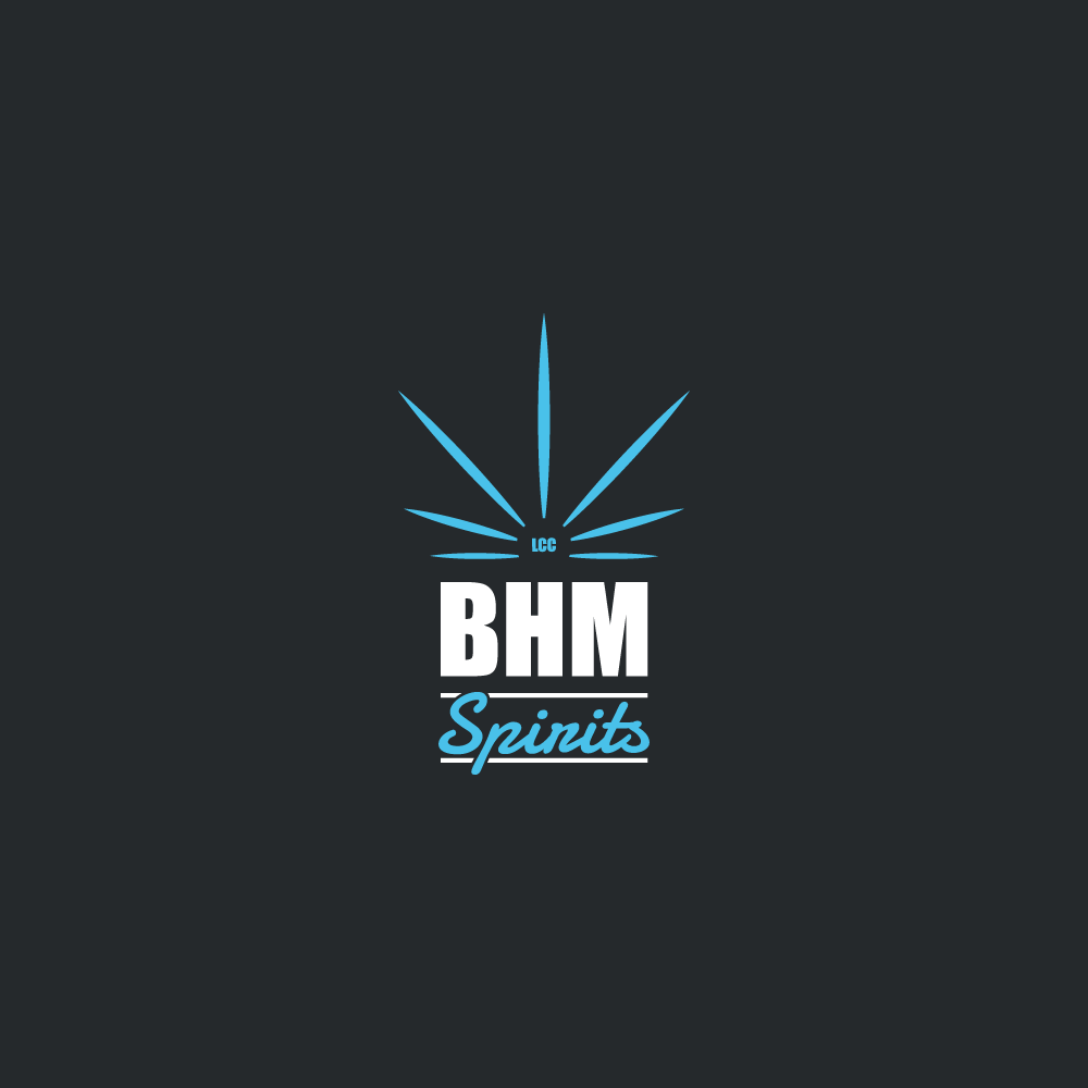
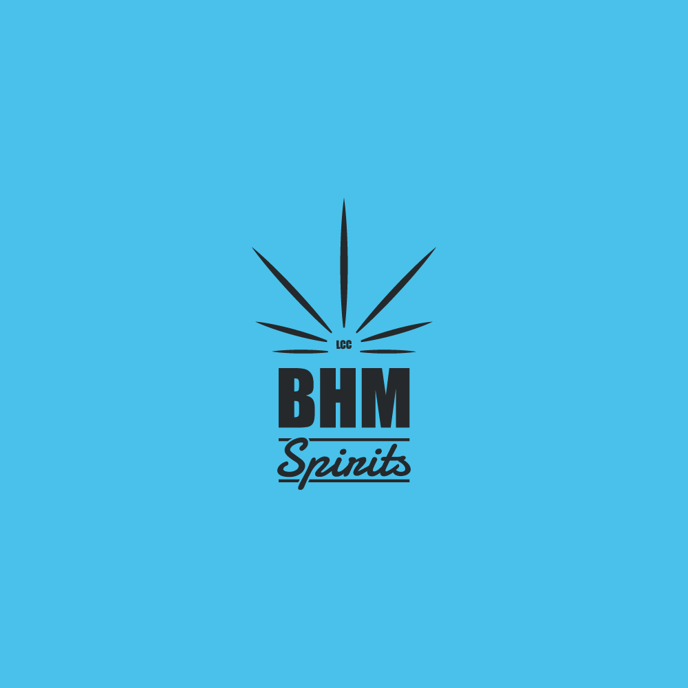
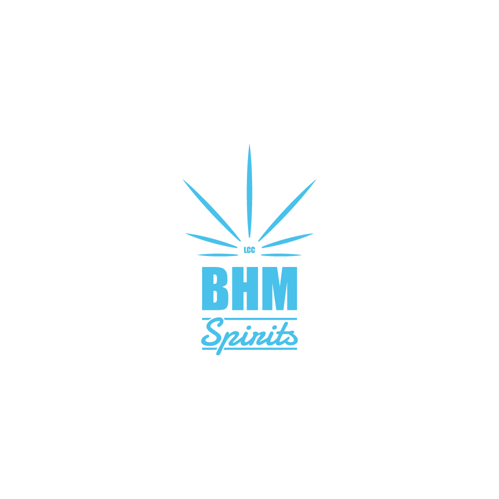
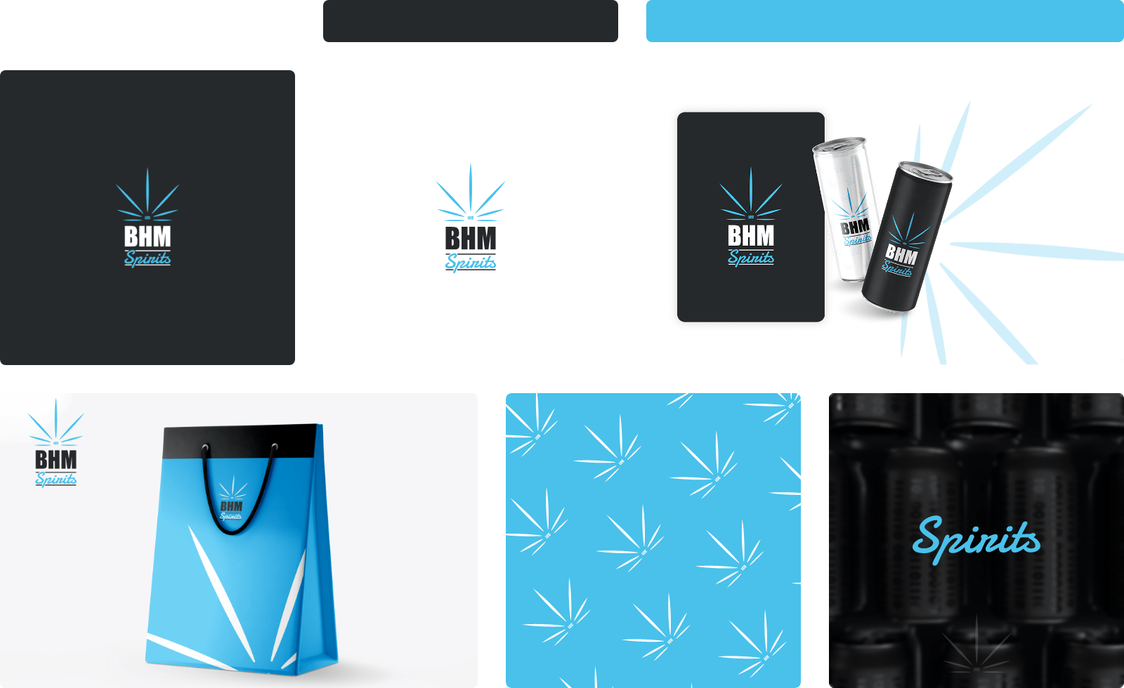
BHM Spirits, beverage company specializing in the distribution of CBD-infused non-alcoholic beverages, sought a distinct logo design that would resonate with its target audience. The primary logo design brief was centered on the integration of a marijuana leaf, a symbol of CBD, into a modern and minimalist style that signifies the core product offering but also conveys a contemporary and clean aesthetic.
Cool and refreshing colors were chosen, resonating with the soothing and refreshing qualities of the drinks.
The resultant logo design captures the spirit of BHM Spirits, blending symbolism with a modern sensibility, and a refreshing visual identity to appeal to its target market.
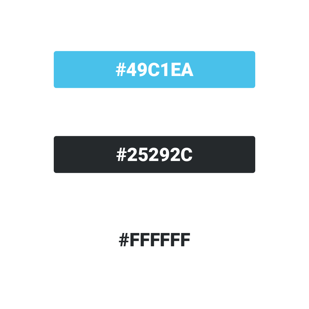
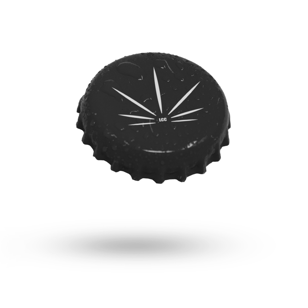
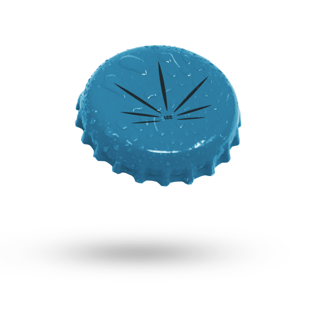
Colors
The selection of primary colors embraces a refreshing and soothing palette. These hues are not only visually appealing but also create a sense of calm and freshness.
To enhance the logo’s visual impact, a sophisticated dark grey is introduced as a secondary color. This choice provides a pleasing contrast to the primary colors, offering a touch of elegance and balance. It serves not only as a contrasting element but also as a complementary hue, adding depth and versatility to the overall design.
This combination of colors ensures the logo strikes the right balance between vibrancy and subtlety, making it not only visually captivating but also versatile and adaptable to a wide range of applications and contexts.