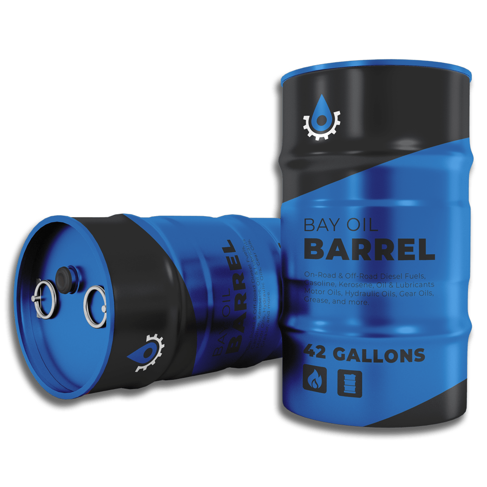
Bay Oil is a company specializing in the processing of raw oil extracted from the bay, coupled with comprehensive logistics services within the oil industry.
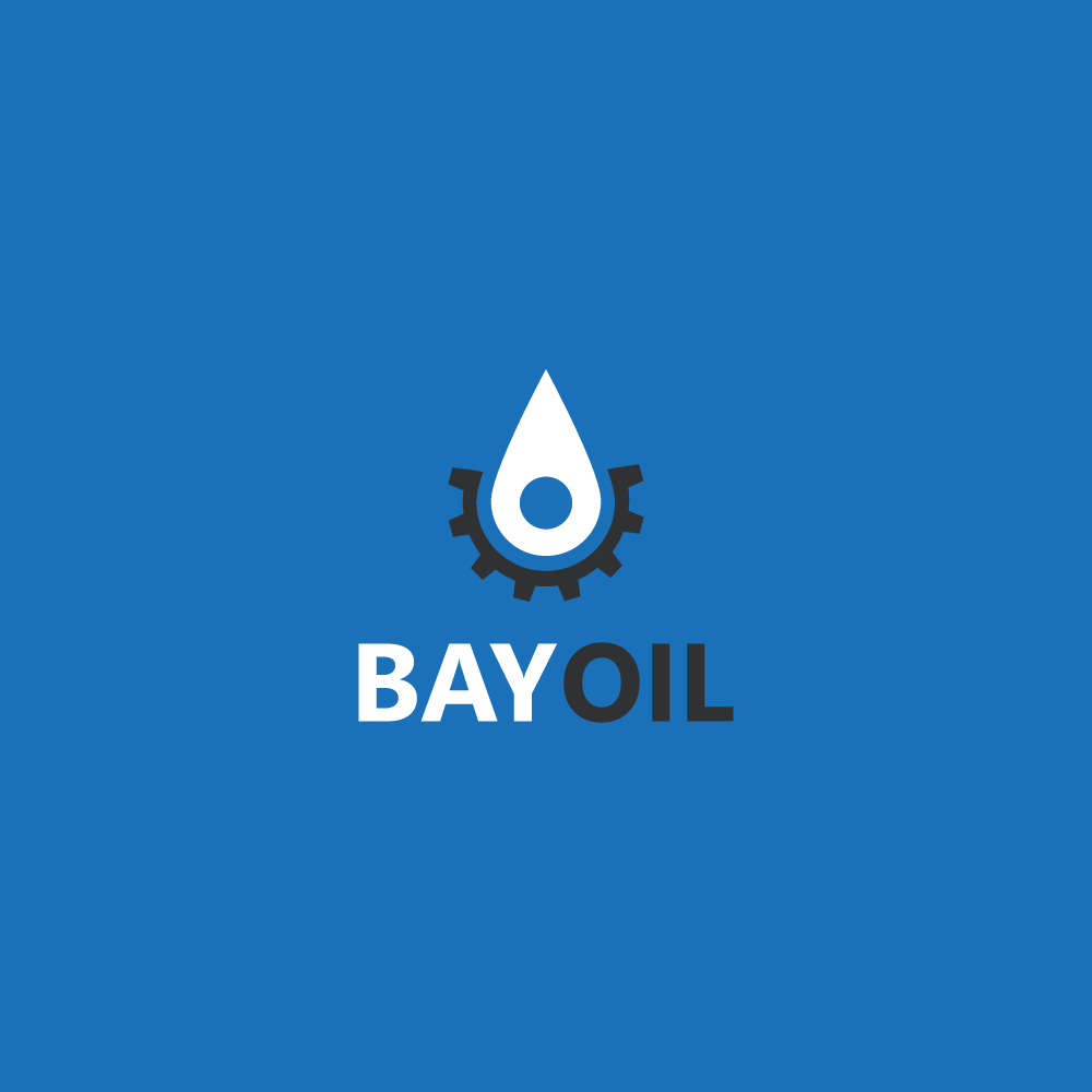
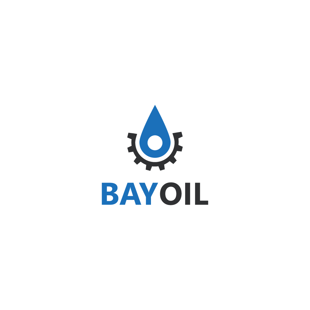
In terms of logo style, the client sought a distinctive logo mark that seamlessly incorporates the company name while symbolizing the key elements of water, processing, and the transformation of raw oil into finished products.
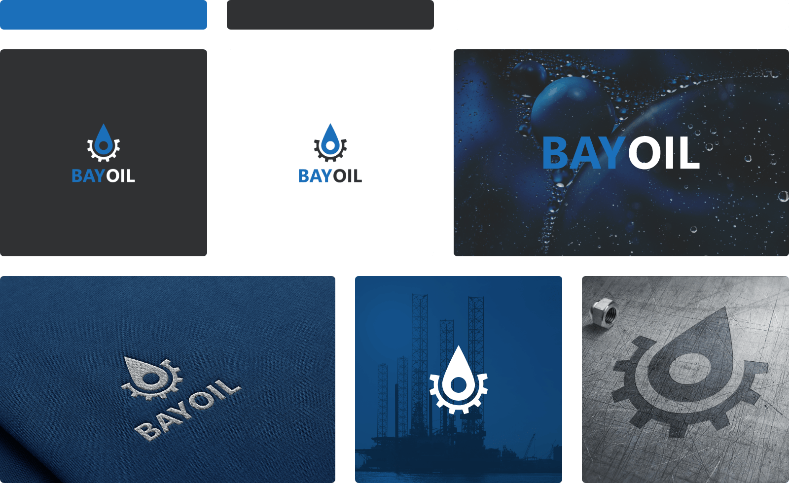
Colors
The chosen color palette for this logo harmoniously blends Azul Blue and Deep Jet Grey. These hues symbolize the essence of water, reflective of the bay and extraction site, as well as the product—oil—that is extracted.
Complementing this primary combination, White is introduced as a secondary color. This versatile addition serves as a complement for various background colors and is strategically applied to specific design elements, ensuring a cohesive and adaptable visual identity for the logo.