Project Brief
Design a logo for a food truck based in Switzerland, serving traditional Balkan cuisine. The main target audience is people from the Balkan region who miss the taste of home.
The logo should include visual hints of the food variety offered, such as grilled meats, chowders, and salads. It should be simple, recognizable, with a playful twist and bold contrasting colors.
After completing the logo, proceed to design and develop a comprehensive brand identity that aligns with the logo’s style, tone, and message. This should include the creation of a cohesive visual identity system—encompassing color palette, typography, iconography, imagery style, and other key elements—that consistently reflects the brand’s personality and values.

Design Methods
I began with thorough research of the food truck industry, competitors, and Balkan cuisine, which helped shape the initial mood board and sketches. Once the design direction was approved, I created the logo and a custom typeface. Several options were presented, and the client selected the one that best represented their brand.
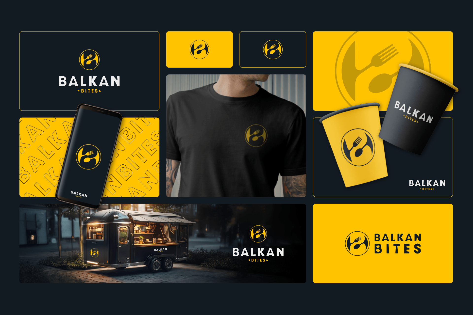
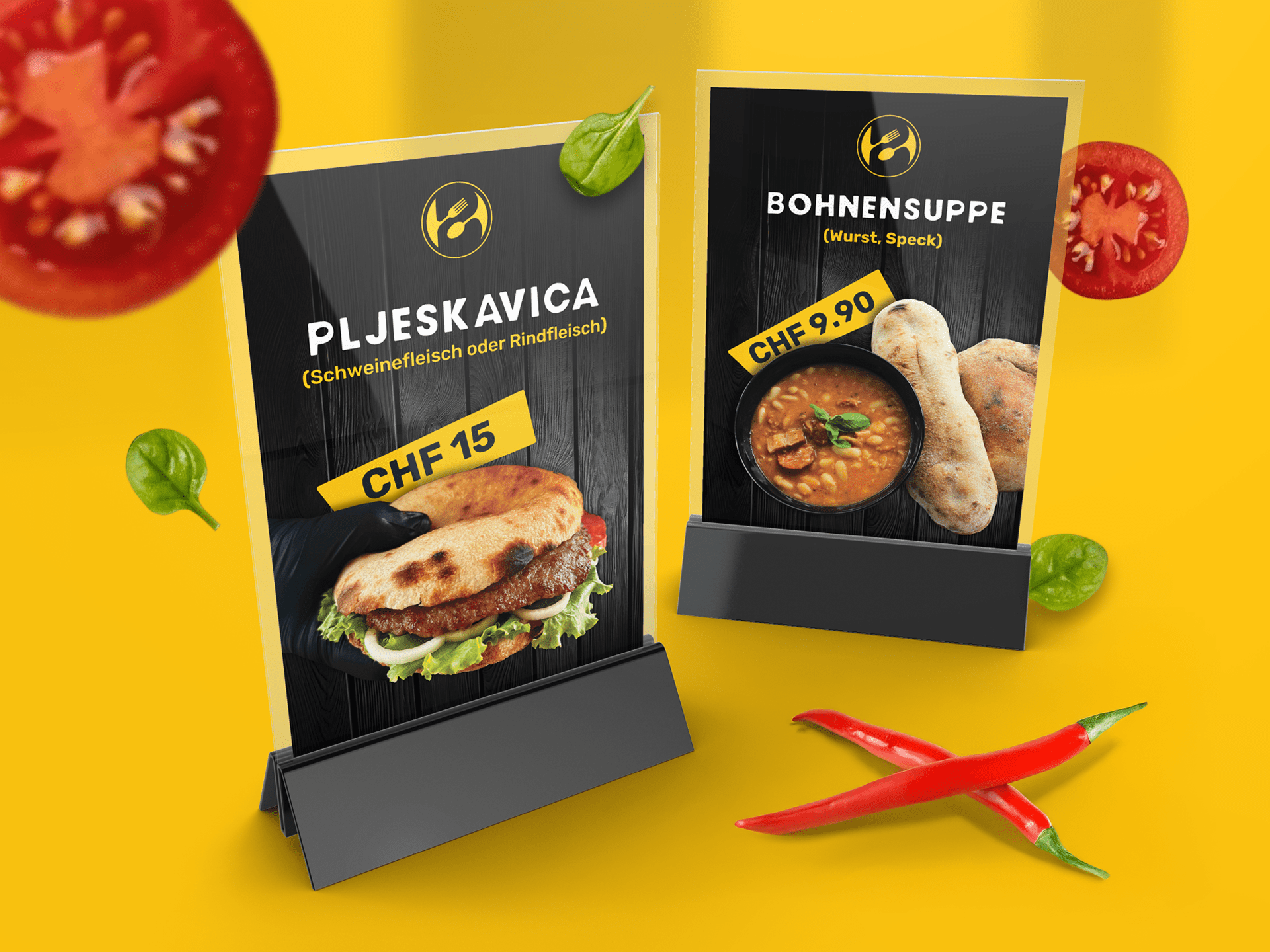
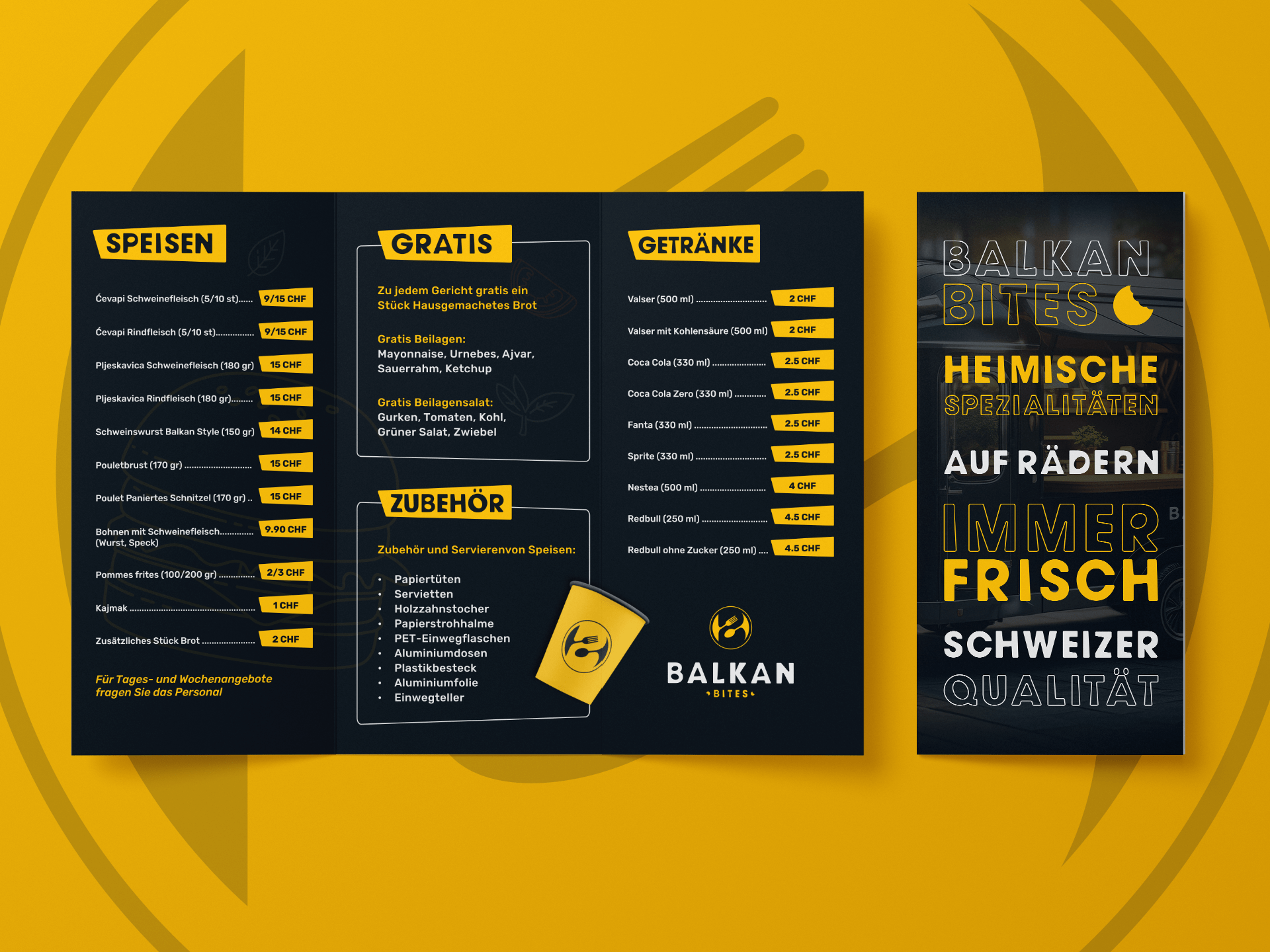
After finalizing the logo, I continued with developing the full visual and brand identity that contains print and marketing collateral, color combinations, typography, logo and brand usage, etc.
Primary colors
Balkan Bites employs three primary colors that are prominently featured across all brand mediums.
The brand is best suited for a “dark theme” visuals. While the branding should primarily be used on dark backgrounds,
it is not exclusively restricted to them.
For light backgrounds, various combinations of primary color shades and tints are utilized, as well as some combinations with secondary colors.
Secondary colors
Secondary colors are mainly used in conjunction with primary colors for both light and dark backgrounds.
Typically, secondary colors do not stand alone without primary colors, except in certain design details and illustrations, such as food illustrations, shapes, and similar elements.
Secondary colors are also introduced to break up the dark trio of primary colors, adding a colorful palette to enhance the brand’s visual appeal, which is connected to street food.
These colors provide versatility and vibrancy, making the brand more engaging and dynamic across various media.
Logo variations
1. Primary logo
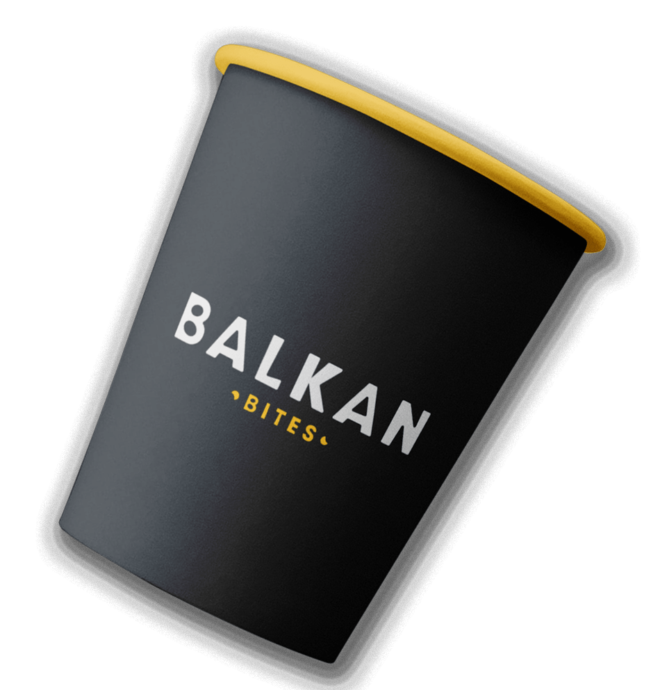
The primary logo should be used most frequently, especially when no spatial limitations exist. It represents the brand’s core visual identity and ensures maximum recognition across various platforms and materials.
2. Horizontal logo
The horizontal type logo is typically used in scenarios where a wider, more linear space is available and better suits the layout, such as Website headers, email signatures, some advertisements, etc.
3. Logo icon
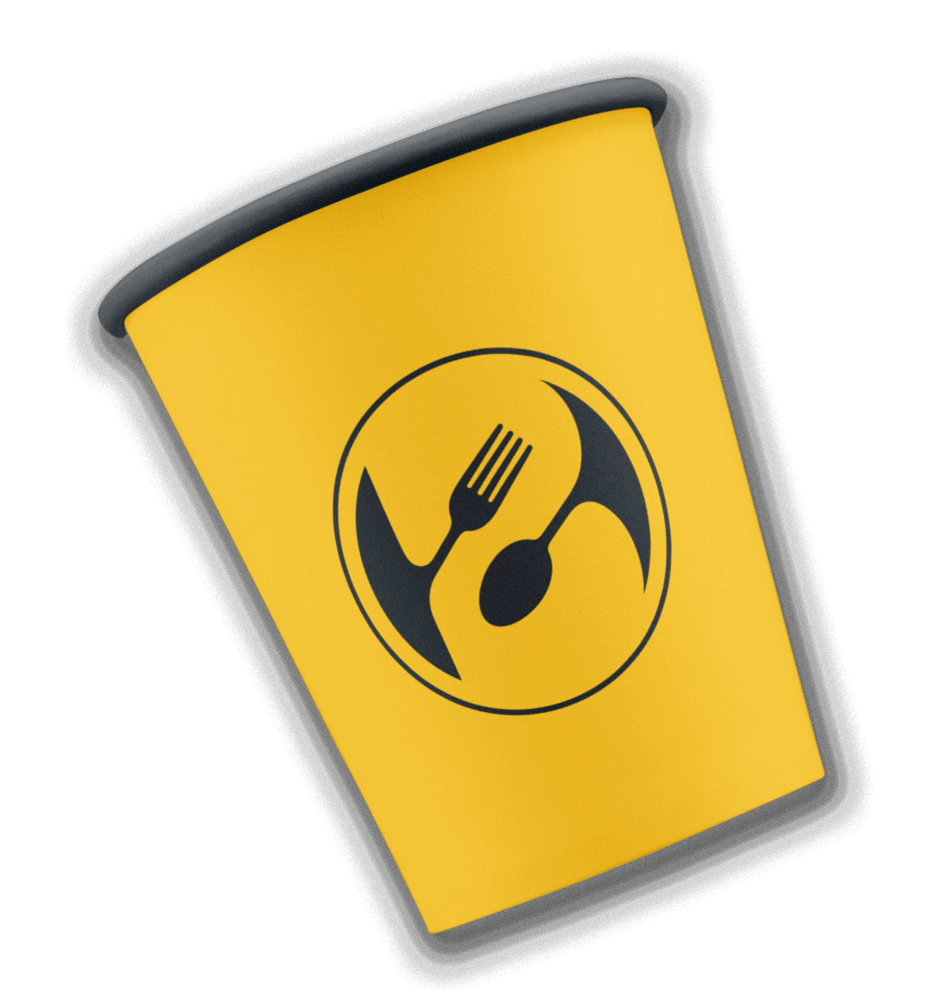
The logo icon is typically used in scenarios where a more compact brand representation is needed or where space is limited. Social media profile pictures, App icons, Favicons, Watermarks, etc.
Typography
Balkan Bites utilizes two typefaces:
1. Custom typeface
This typeface is specifically designed for the brand and exclusively uses capital letters. It features rounded edges, asymmetrical elements, and a playful visual appeal.
The brand name in the logo is constructed using this typeface. It is primarily used for titles, subtitles, and larger text needs. Additionally, this typeface is utilized for various design elements, ornaments, and background shapes.
2. Rubik typeface
The secondary or complementary typeface is Rubik. This typeface features clean letters and offers a wide range of styles and font weights, making it suitable for both small and large text, longer descriptions, and overall versatile usage.
