This logo was designed for a high-end consulting firm specializing in the energy and power grid sector. Aimed at an elite clientele, the design reflects strength, precision, and reliability. Inspired by the founders’ Navy SEAL background, it incorporates elements of discipline, strategy, and resilience.
The result is a sophisticated and authoritative visual identity that embodies the firm’s expertise and commitment to excellence.
The goal of this logo was to create a simple, clean, and memorable design while honoring the founders’ Navy SEAL background.
Logo icon meaning
The logo icon integrates multiple symbolic elements:
A top-down view of a boat, representing the Navy.
A shield shape, symbolizing security and strength.
The letter “S” reflects the company’s name.
Inspiration from the Navy SEAL ranking insignia.
The final design seamlessly blends these elements into a bold, sharp, and masculine icon that is both elegant and impactful.
Colors
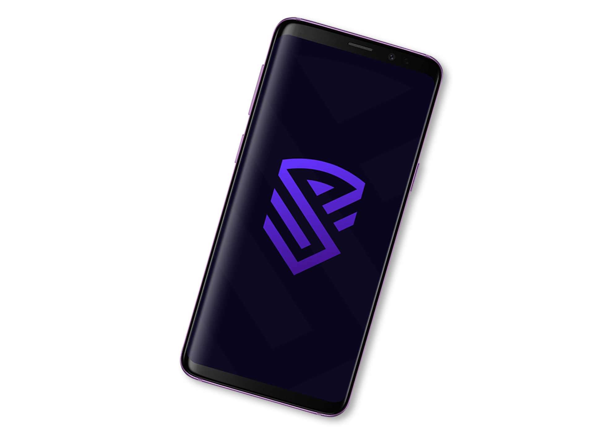
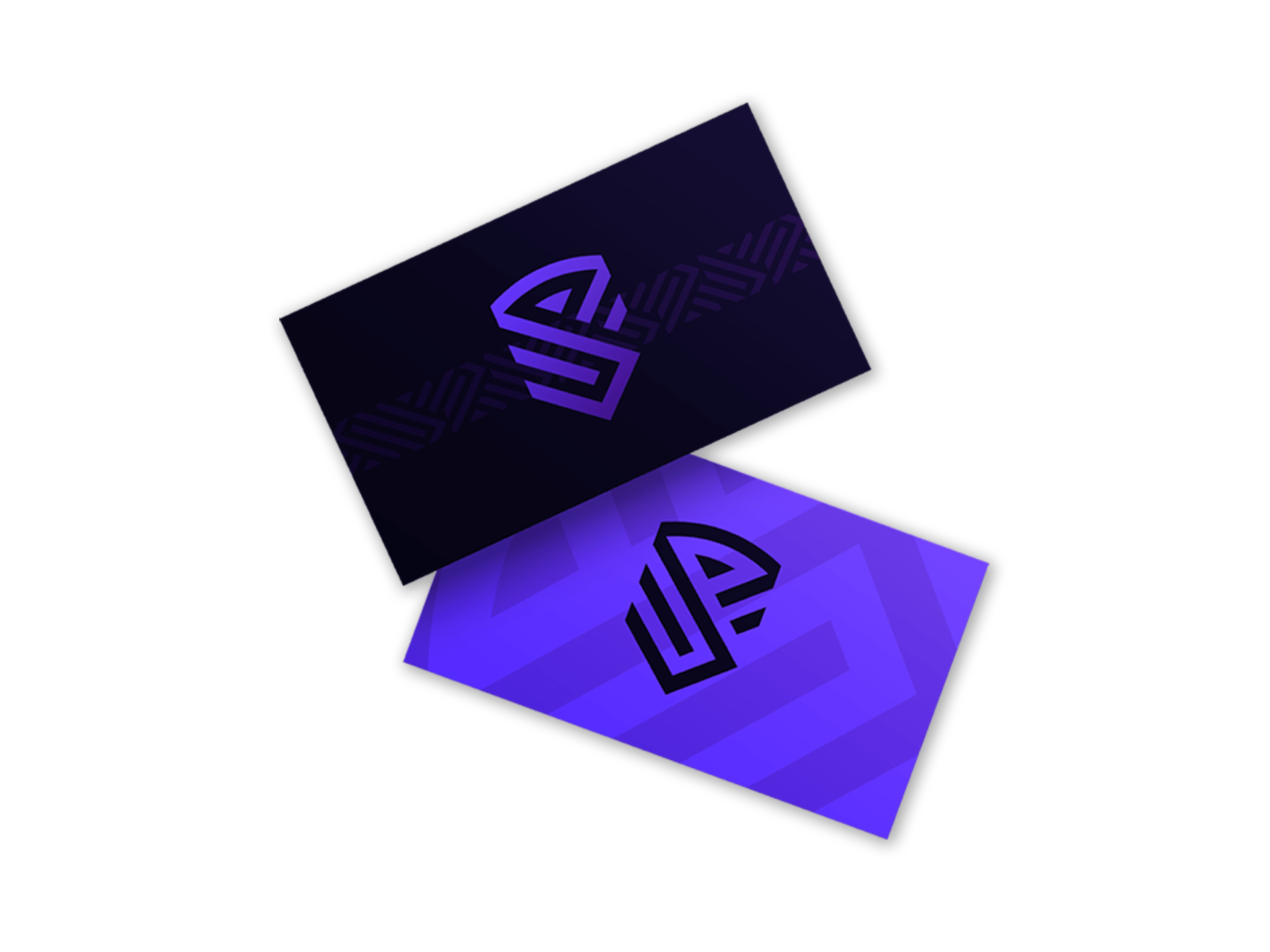
Sandrax logo utilizes four core color combinations and is best suited for use on a dark-themed background.
Rich black is primarily used for backgrounds, as well as for background elements and patterns when placed on lighter surfaces. It provides a strong base and reinforces the logo’s bold presence.
Indigo and Electric Indigo form a smooth two-tone gradient used in the icon. This gradient subtly transitions between the two shades, creating a modern and dynamic visual effect that enhances the logo’s bold and futuristic aesthetic.
White serves as a complementary color, primarily used for text. It stands out sharply against dark backgrounds, adding clarity and clean contrast to the overall visual identity.
Logo variations
1. Primary logo The primary logo serves as the main representation of the brand and should be used in most applications, particularly where there are no space constraints. It establishes the strongest brand recognition and is ideal for both digital and print materials.
2. Horizontal logo The horizontal version of the logo is designed for wider layouts where a linear format is more appropriate. This version works well in website headers, email footers, banners, and select advertising spaces where horizontal alignment enhances visual balance.
3. Logo icon The logo icon offers a simplified, compact version of the brand mark, perfect for use in small-scale or space-restricted environments. It’s ideal for social media avatars, mobile app icons, browser favicons, watermarks, and similar applications.