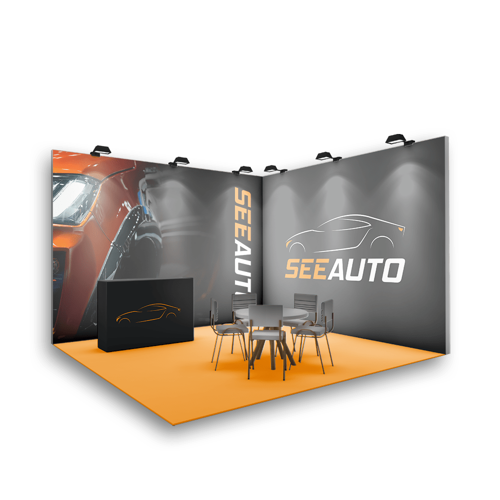
See Auto is a medium-sized exposition and conference, focusing on the latest and contemporary car models. In addition to the exhibition, See Auto curates meetups and discussions, providing enthusiasts with insightful conversations about the newest additions to the automotive market.
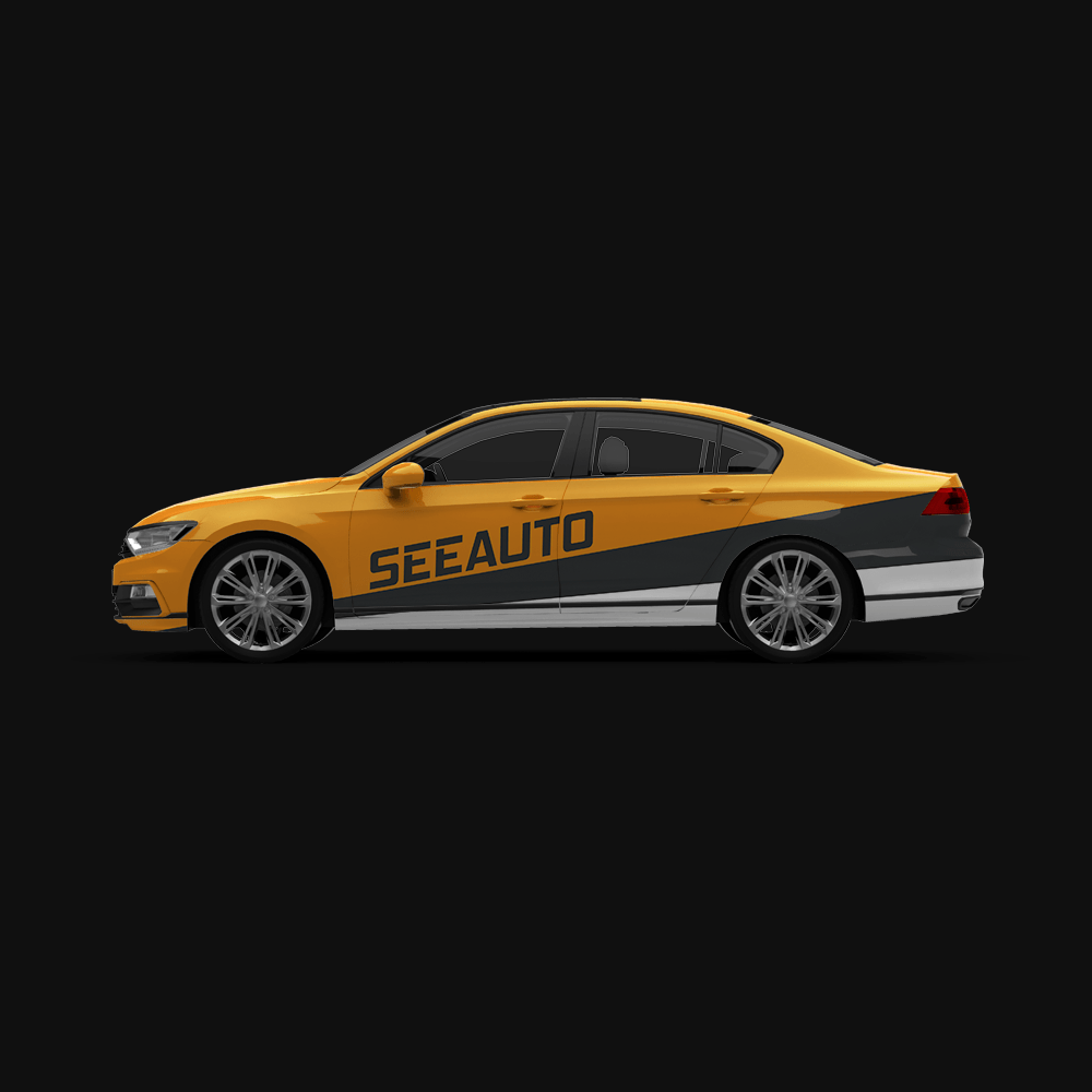
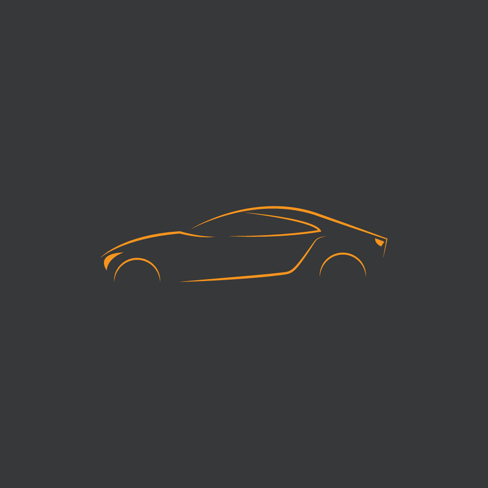
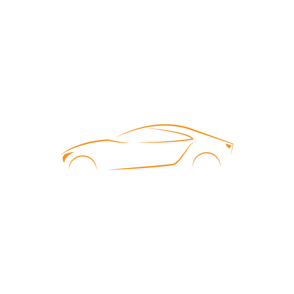
In terms of design, the client wanted a modern, bold, and luxurious aesthetic, with a particular emphasis on incorporating the vibrant and dynamic hue of orange. This vibrant hue serves as a focal point, injecting energy and vibrancy into the logo design
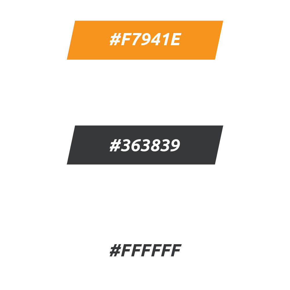
Colors
The vibrant and energetic hue of orange is strategically incorporated as both a primary shade and an accent color. This dynamic choice not only captures attention but also symbolizes enthusiasm and vitality.
To enhance and complement the primary color, a refined combination of mid-dark grey and pristine white has been introduced. These secondary colors play a pivotal role in establishing a harmonious visual balance. The mid-dark grey provides a sophisticated contrast, adding depth and sophistication, while white contributes a sense of clarity and refinement.