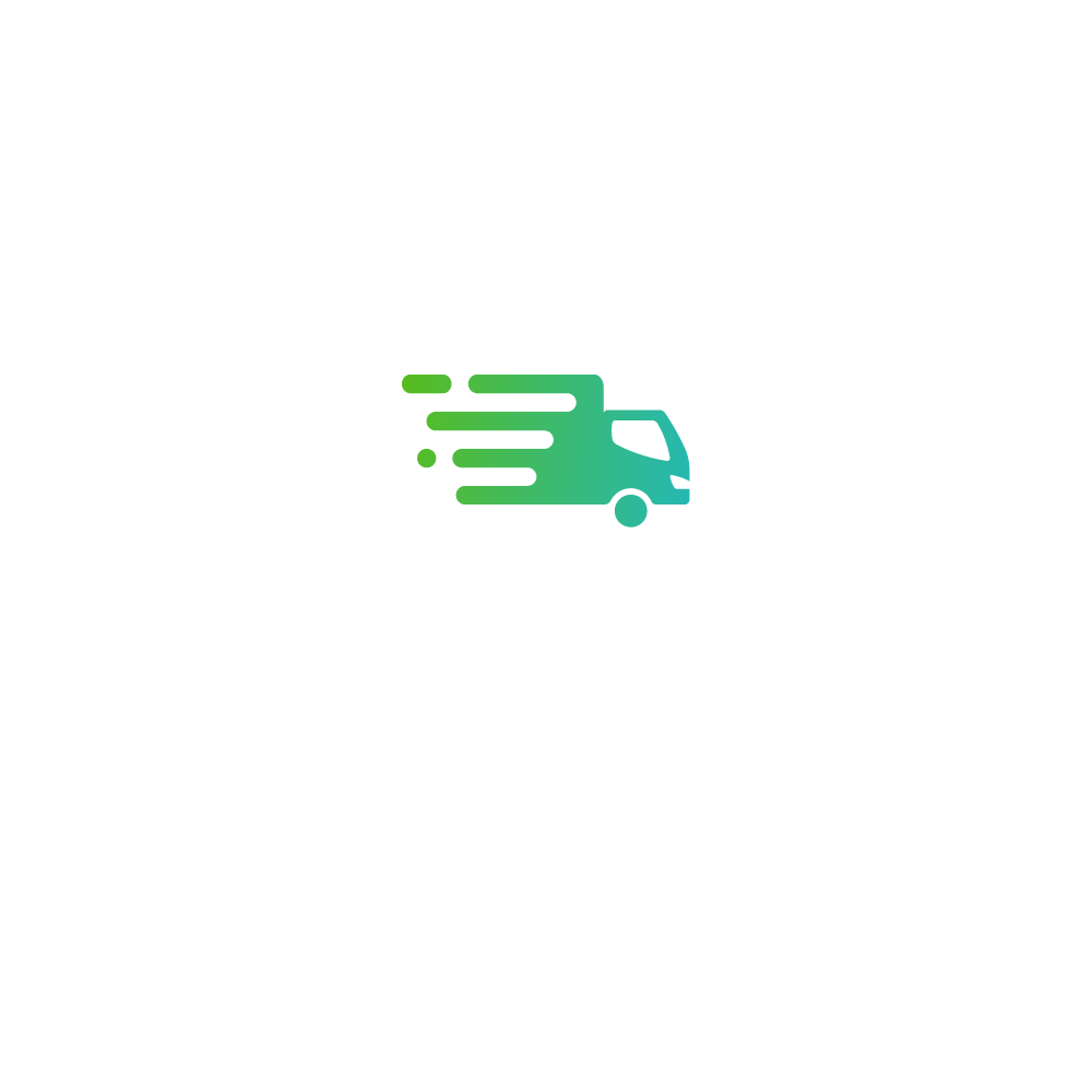
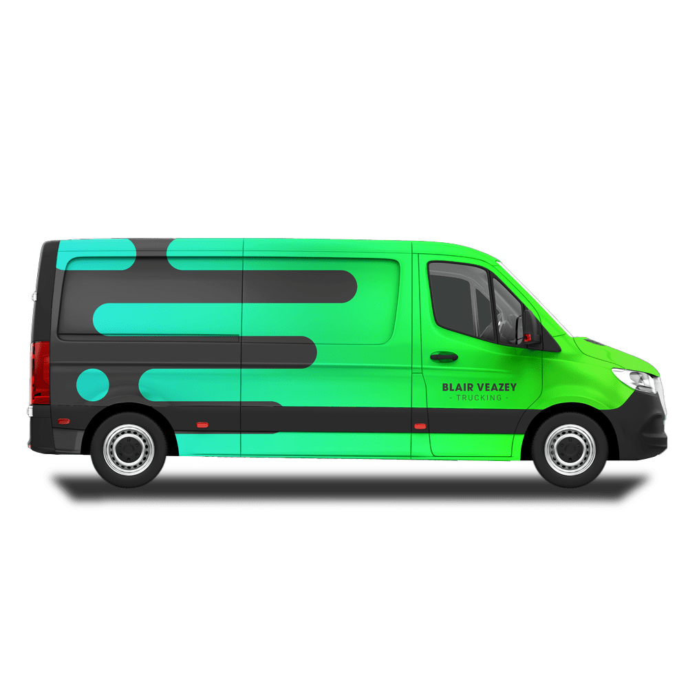
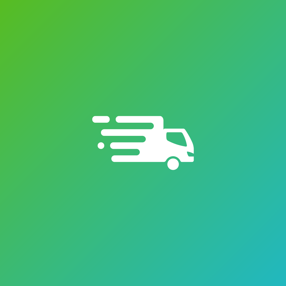
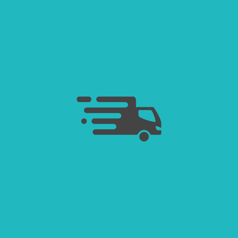
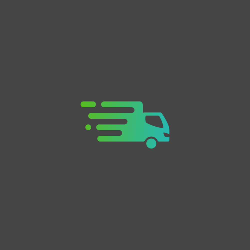
Blair Veazey is a trucking company specializing in delivery and logistics services, operating predominantly within the northern regions of the United States. The client’s vision for the logo design is centered on a palette of cool and serene colors, invoking a sense of calm. The icon features a truck illustration, symbolizing their core business, while also incorporating design elements that convey notions of speed and swift delivery.
Additionally, the logo is tailored to embrace a moderately modern aesthetic, characterized by a blend of muscular and sleek elements, aligning seamlessly with the company’s identity.
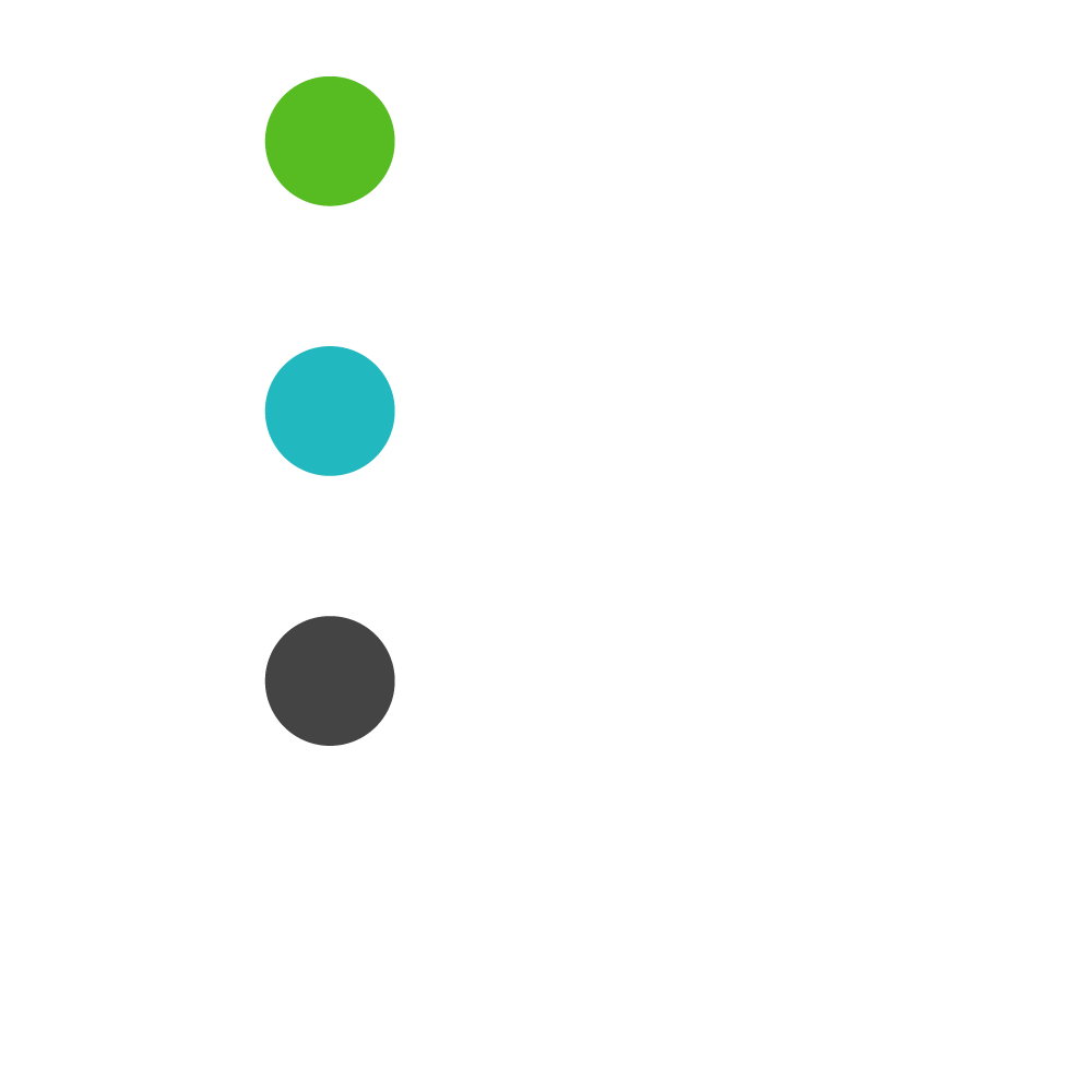
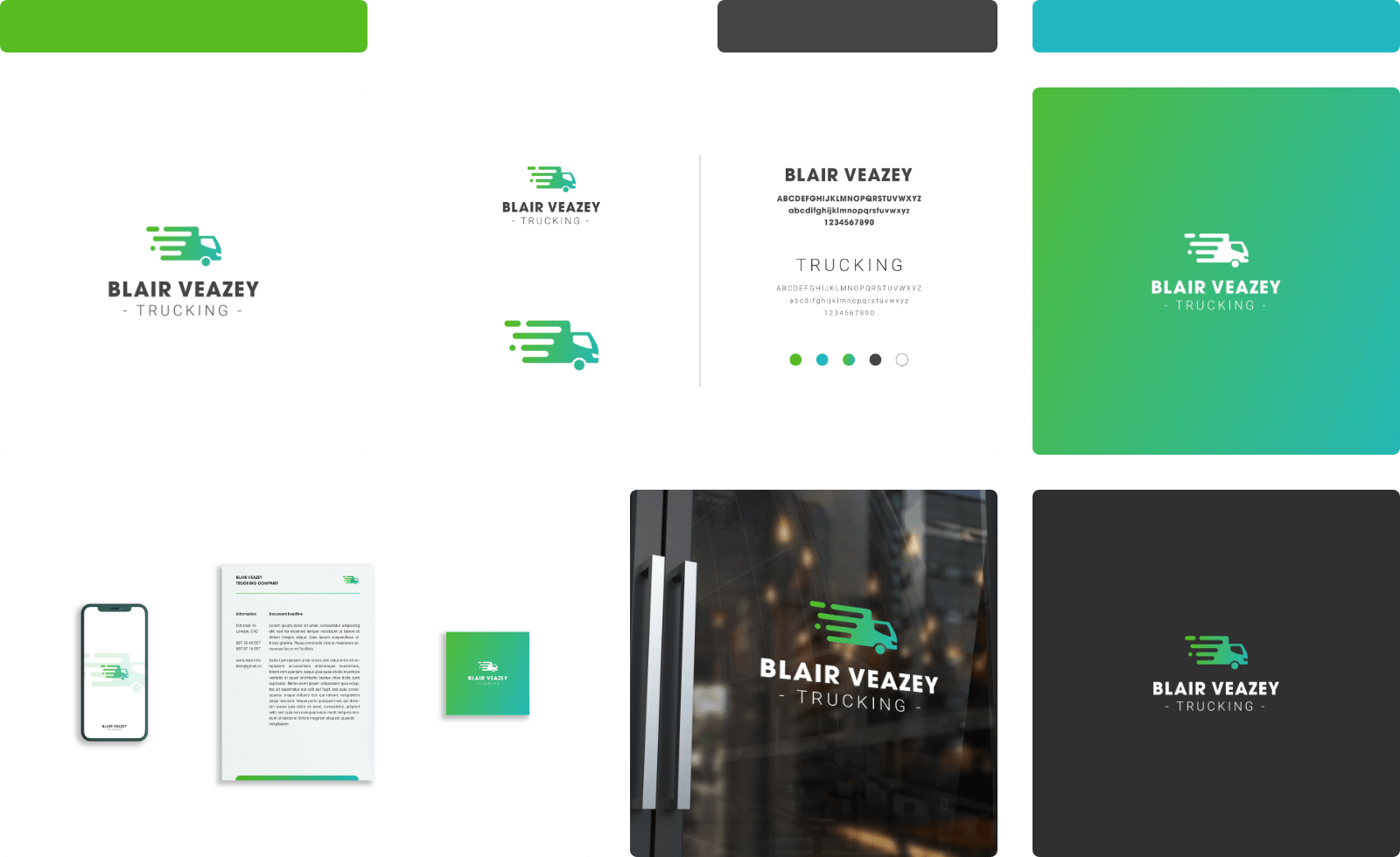
Colors
As per the client’s specifications outlined in the brief, the primary color palette chosen for the logo design exudes a sense of serenity and coolness.
Kelly green and Verdigris blue colors were selected to create a seamless gradient within the logo icon. These two colors can be independently applied across various applications, serving as versatile options for backgrounds, design elements, and other design purposes.
Complementing the primary colors, Onyx grey and white are incorporated as secondary colors, mainly utilized for text, ensuring readability across diverse background colors and enhancing the logo’s overall flexibility.
Typography
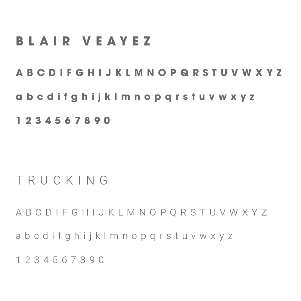
For the company name and as the primary typeface, ITC Avant Garde Gothic Bold, enhanced with a font modification that sets the tracking at 50, is incorporated.
As a secondary typeface, exclusively serving the tagline’s purpose, Heebo Light typeface is used, further customized with a tracking value set at 400.
These two selected typefaces share common traits of cleanliness, readability, and a minimalist aesthetic, ensuring a polished and uncomplicated look for the logo’s typography.