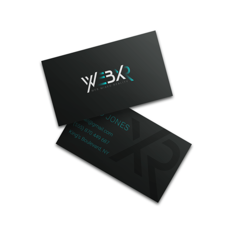
Web Mixed Reality, also known as WebXR, is a dynamic development agency with a focus on web development and IT consulting services.
Client’s vision for the logo encompassed a wordmark-style design, capable of versatile scaling to suit various purposes. Additionally, the design brief emphasized a contemporary, futuristic aesthetic with a touch of geometric precision, all within a tech-savvy context.
The primary audience for this logo includes younger developers ranging from 20 to 40 years old, as well as IT business proprietors and forward-thinking entrepreneurs.
This logo is set to take center stage across web platforms, mobile applications, and IT-related advertising materials, ensuring a strong online presence and resonating with the digital-savvy audience.
Typography
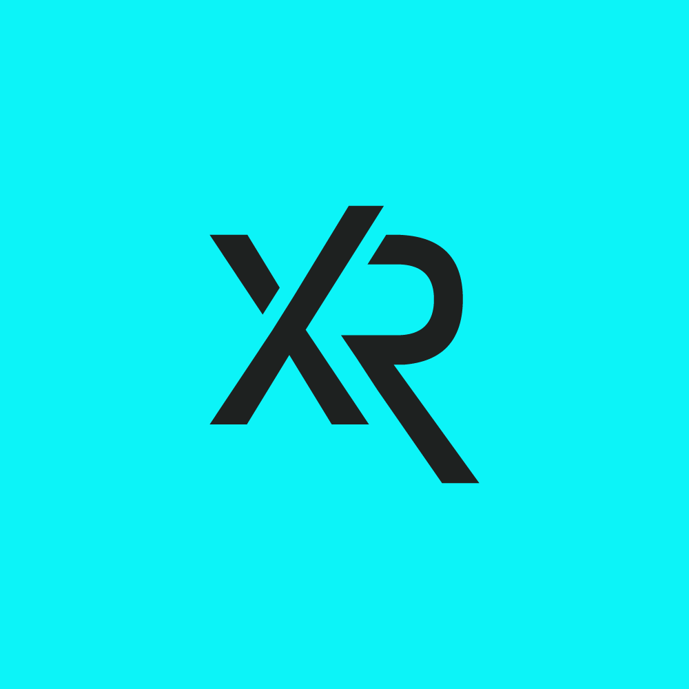
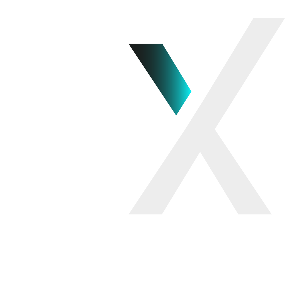
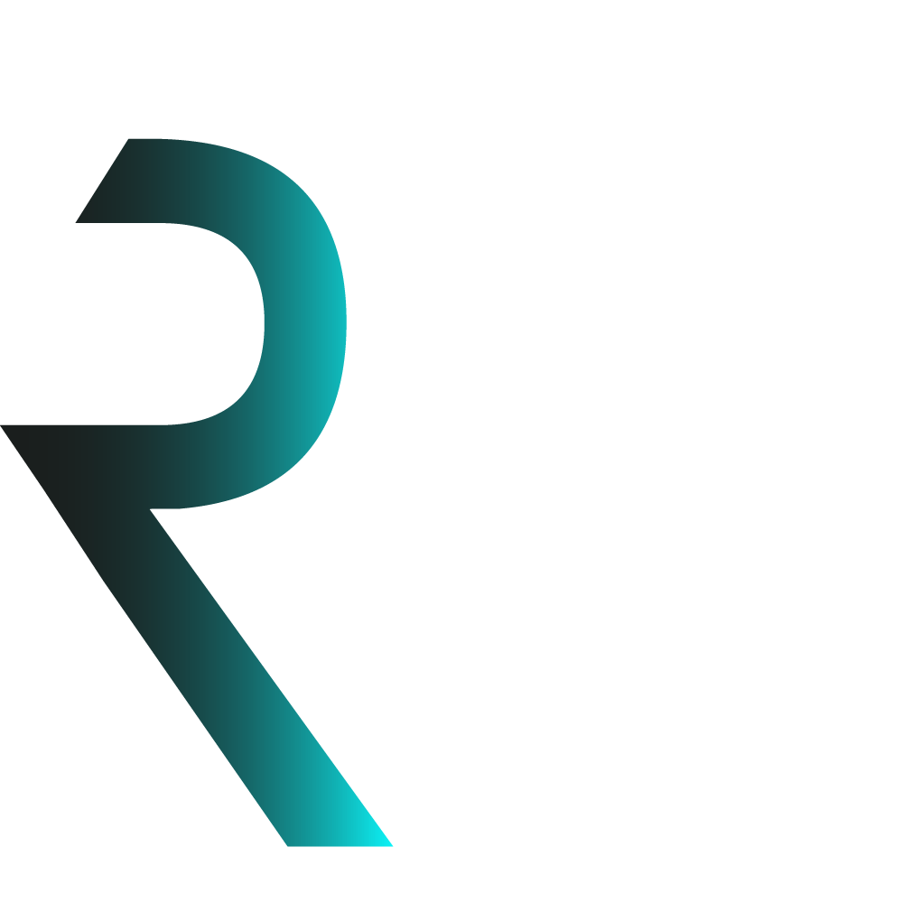
The wordmark is created using fundamental shapes and colors, sans any specific typeface.
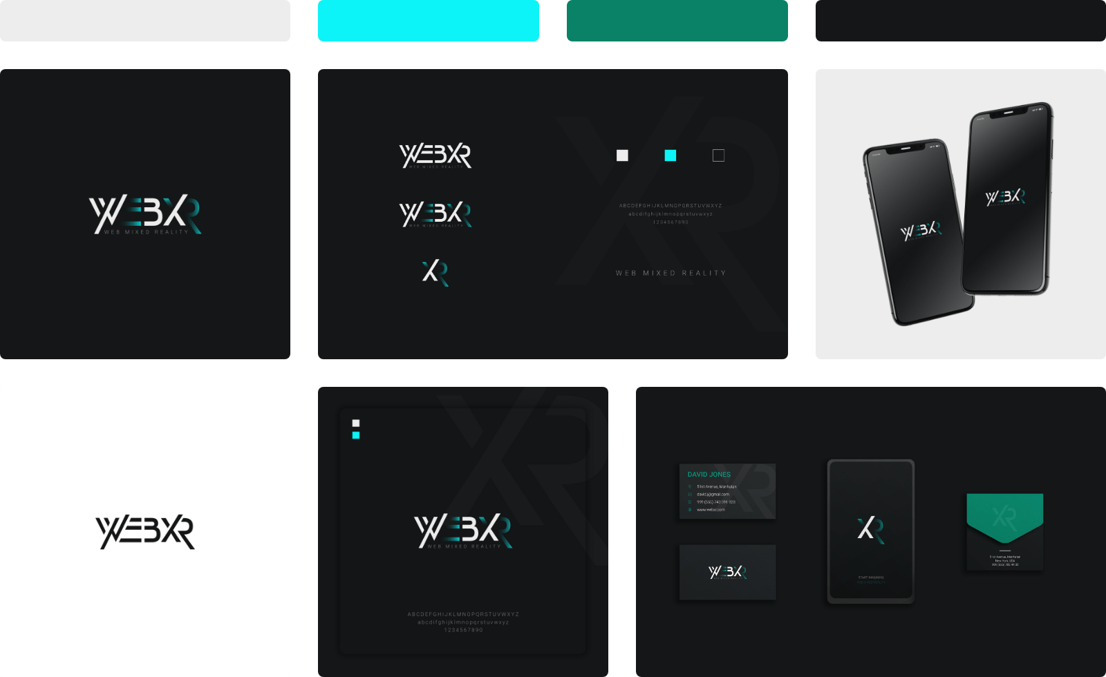
To maintain clarity and elegance, the agency name and primary text descriptions are elegantly presented in Roboto Thin Typeface. A tracking value of 400 is applied to enhance readability and spacing.
The Roboto typeface is characterized by its clean and visually pleasing attributes, making it an ideal choice for conveying extended descriptions. With a range of styles available, the example showcases the thin and regular variants, ensuring versatility and legibility across diverse applications.
Colors
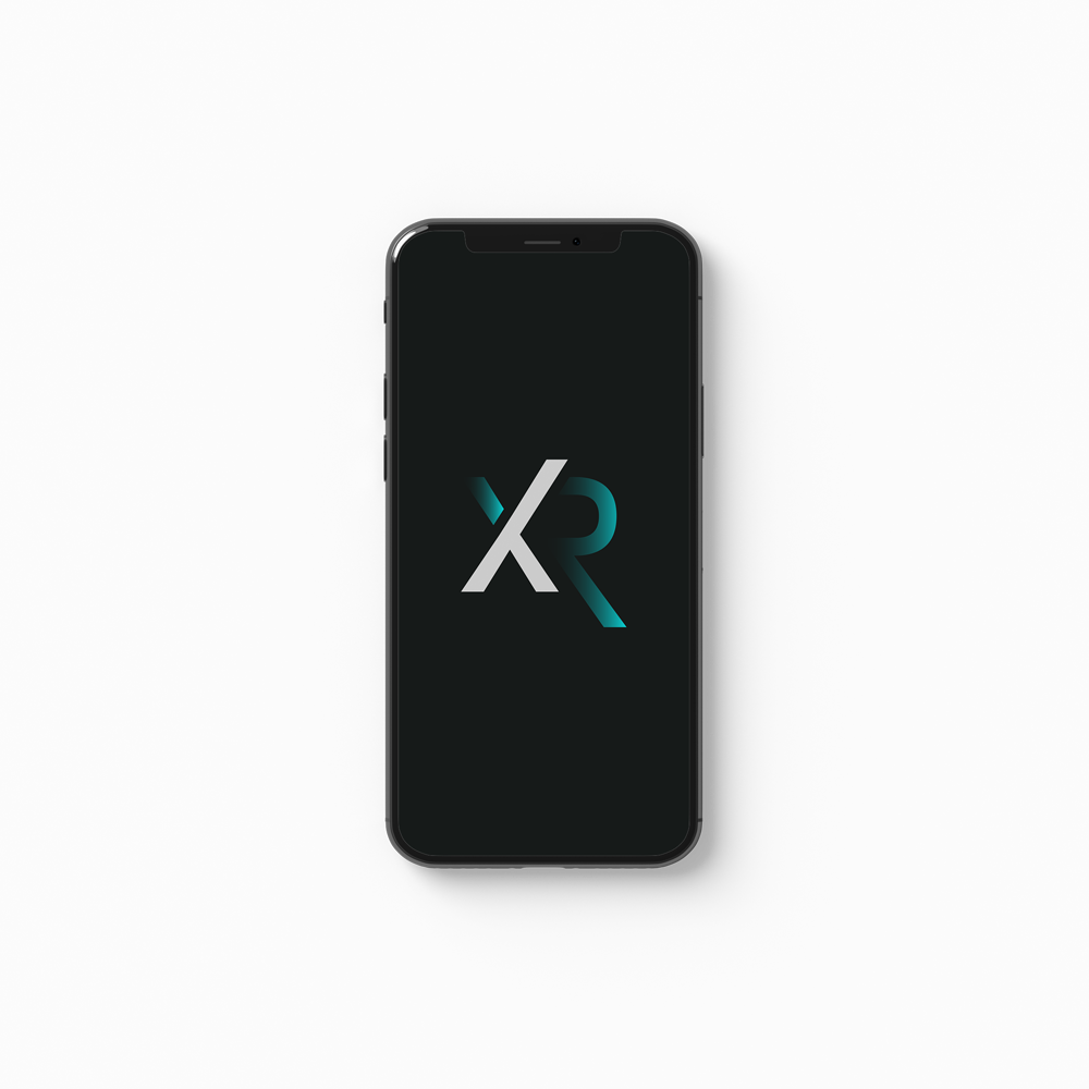
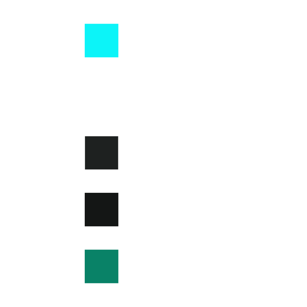
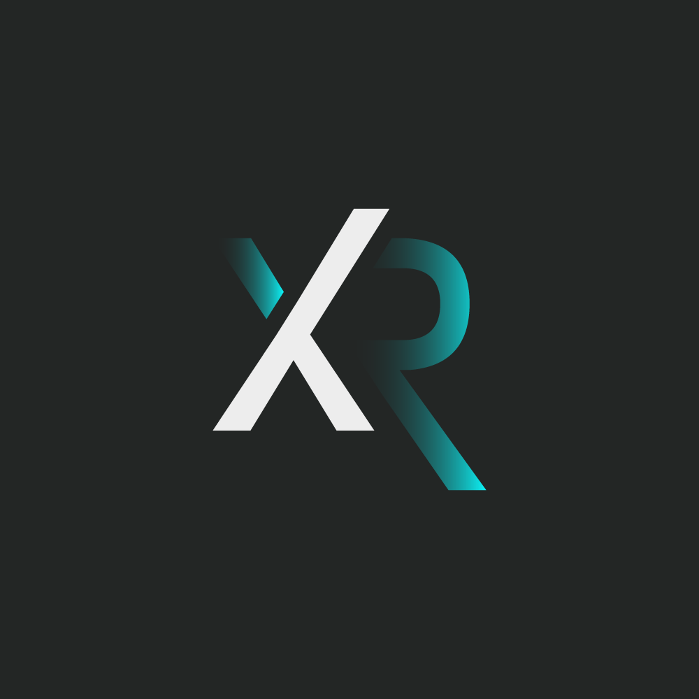
The client’s color palette requirements for this logo were centered around blue and green hues. Given the predominantly dark backgrounds where the logo will be applied, a primary color choice was a light blue, almost bordering on cyan, to ensure optimal visibility and contrast. A smooth gradient transition from 0 to 100% opacity was applied to this color, achieving a modern and futuristic fading effect on select letters.
White was strategically employed for other letters, providing a good contrast against dark backgrounds, and enhancing legibility.
In addition to these primary colors, two shades of dark grey were incorporated for background elements and certain dark design components when set against lighter backgrounds.
Furthermore, a pastel green was introduced as a tertiary color to complement specific design elements, adding a touch of freshness and vibrancy to the overall palette.
Scalability
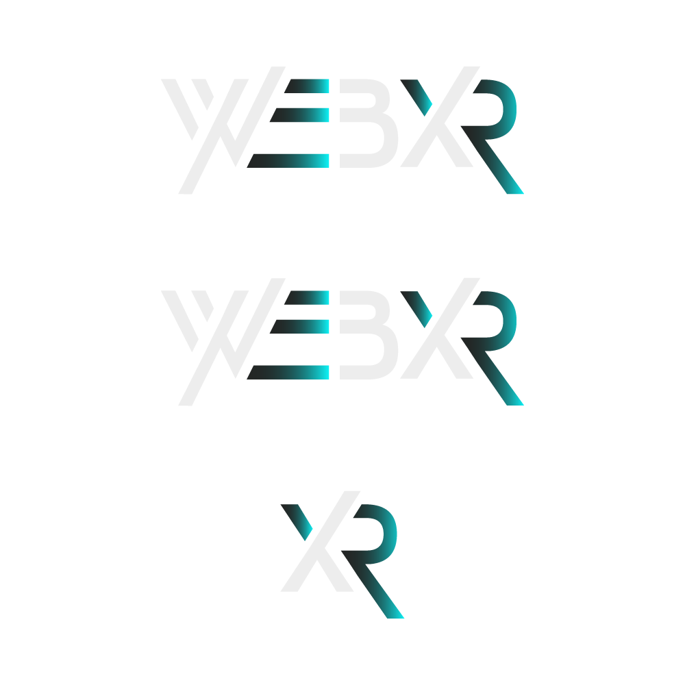
As this logo adopts a wordmark-style, the client placed significant importance on ensuring excellent scalability, particularly for smaller applications and versatile usage. The logo design encompasses three distinct scale options:
Wordmark with Agency Name: The full logo with both the wordmark and the agency name.
Wordmark without Agency Name: The wordmark component stands independently without the agency name.
Icon (Letters XR): This iconic element is derived from the wordmark and is used across various contexts. It serves as a favicon, a simplified app icon, integrates into design elements, background graphics, and even features as a pattern, offering a multifaceted approach to brand representation.