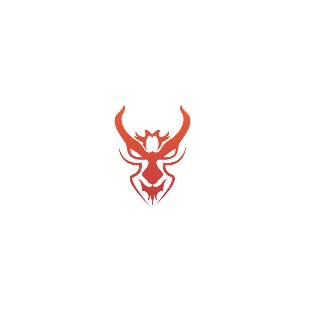
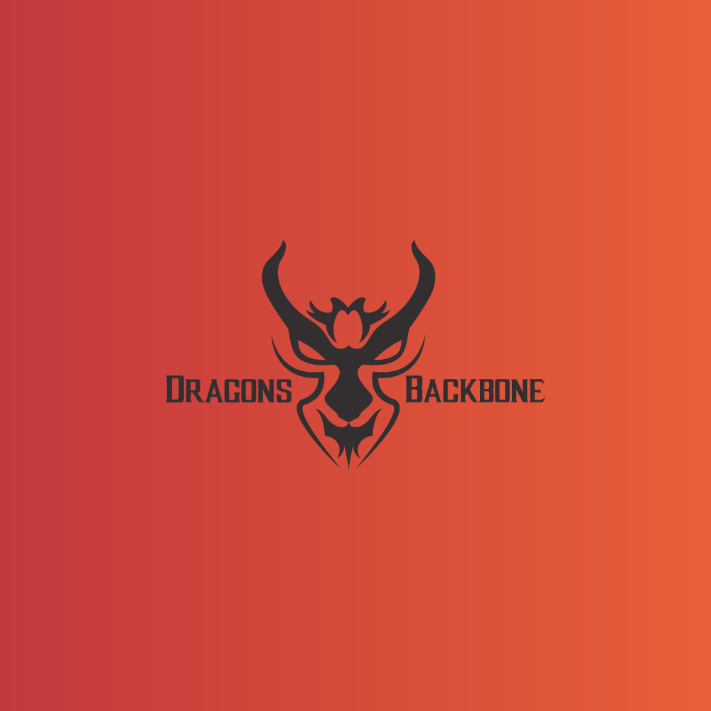
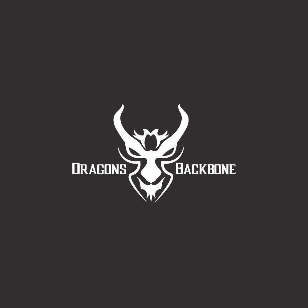
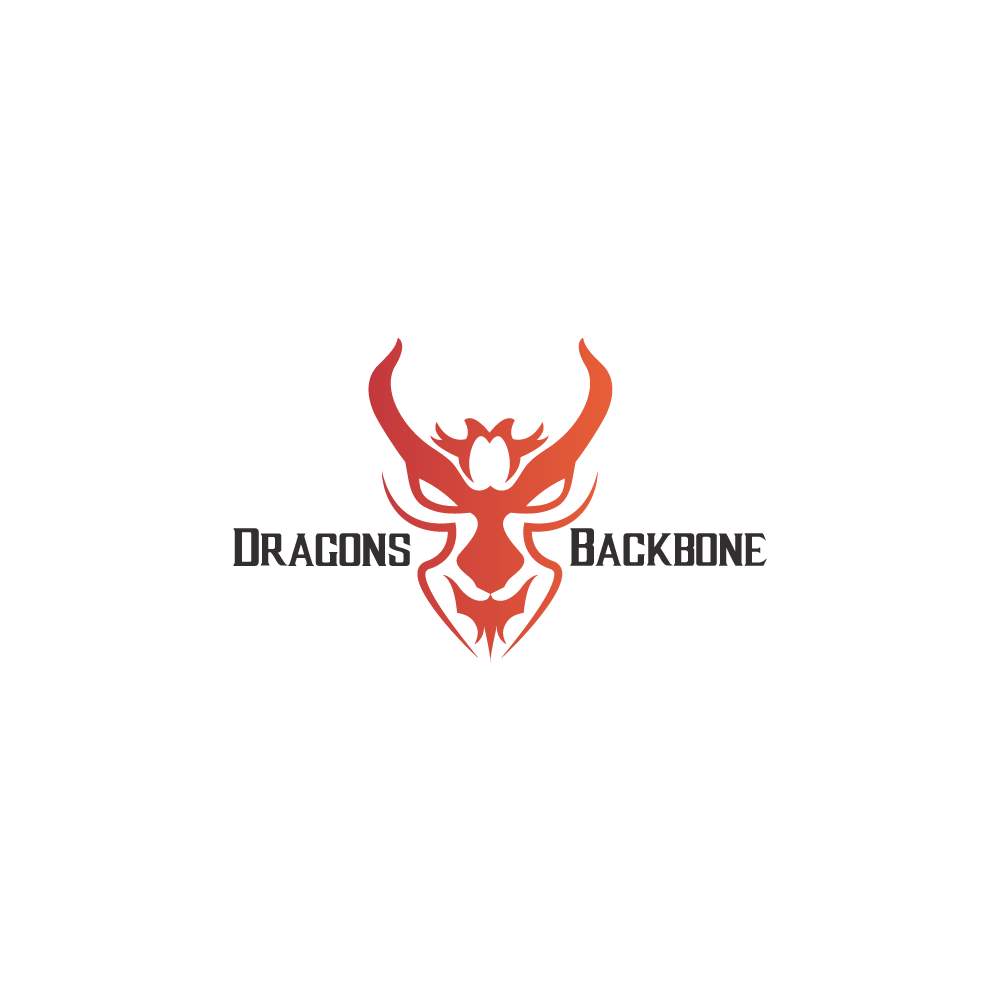
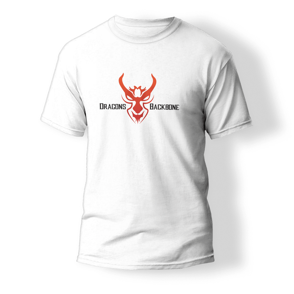
Dragons Backbone is a brand specializing in streetwear and skateboarding gear outlets. In response to the client’s brief, the objective was to seamlessly integrate the brand name “Dragons Backbone” with a visually compelling dragon icon.
The desired style attributes for this logo were distinctly bold, exuding a strong, masculine aura while embracing organic elements. The resulting logo serves the dual purpose of elevating brand recognition across apparel and equipment and attracting the attention of “adrenaline junkies,” effectively capturing the essence and energy of the client’s business.
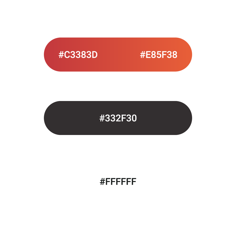
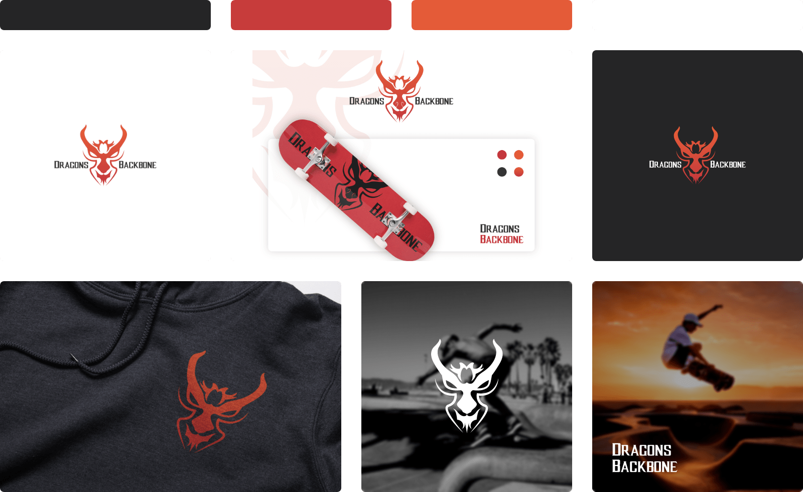
Colors
The client’s vision prioritized the utilization of powerful colors to emphasise adrenaline and masculinity. To achieve this, a palette of robust, commanding colors was adopted.
For the primary color, a dynamic red and orange gradient was selected, echoing the fiery intensity that symbolizes the brand’s identity.
As for secondary colors, a combination of dark grey and white was introduced, primarily serving text and descriptive elements, in addition to adapting to various background colors as needed.